Responsive Web Design: Techniques and Best Practices
Responsive web design is a term frequently used in web design and development. But what exactly does it entail? This blog post will introduce the multitude of facets of responsive web design, as it covers more ground than one would initially think.
Definition
"Responsive web design (RWD) is a web development approach that creates dynamic changes to the appearance of a website, depending on the screen size and orientation of the device being used to view it."
- Nielsen Norman Group
While this definition emphasizes screen size, a broader perspective considers the diverse contexts in which a website is accessed:
Responsive web design is an approach that factors in all the different environments in which a website is displayed
Benefits
In modern web development, focused on metrics, responsive web design is somewhat overlooked. Due to its complex and interpretive nature and the countless possible environments it can be challenging to implement, test, and measure.
It is clear however that, every user having their own unique environment, good responsiveness will have a positive impact.
Each aspect of this guide will feature a brief introduction, methods, guidelines, and potential pitfalls for an effective implementation.
Display & Window Parameters
When it comes to responsive web design, the most crucial parameters are the display and window parameters. These include:
Width
Width is the primary consideration in responsive web design. It involves several key elements:
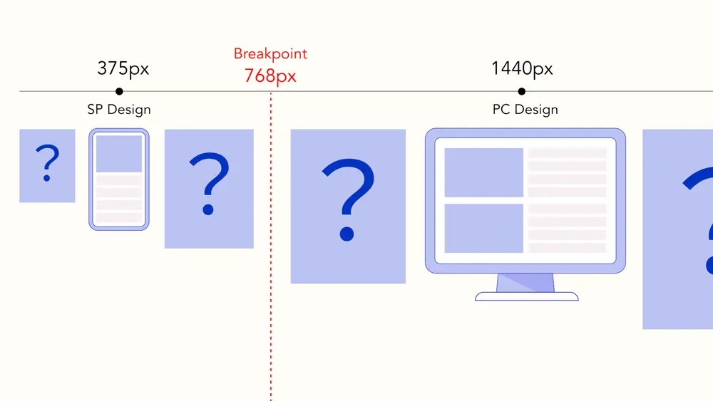
- Design: Different base designs for various width categories.
- Breakpoints: Define the points at which each design is applied based on screen width.
- Adaptation: Specify how the design should adjust between these breakpoints. For example, if you have a mobile design at 375px with a breakpoint at 768px, it's essential to define how this design adapts between 375px and 768px.
Grid Layout
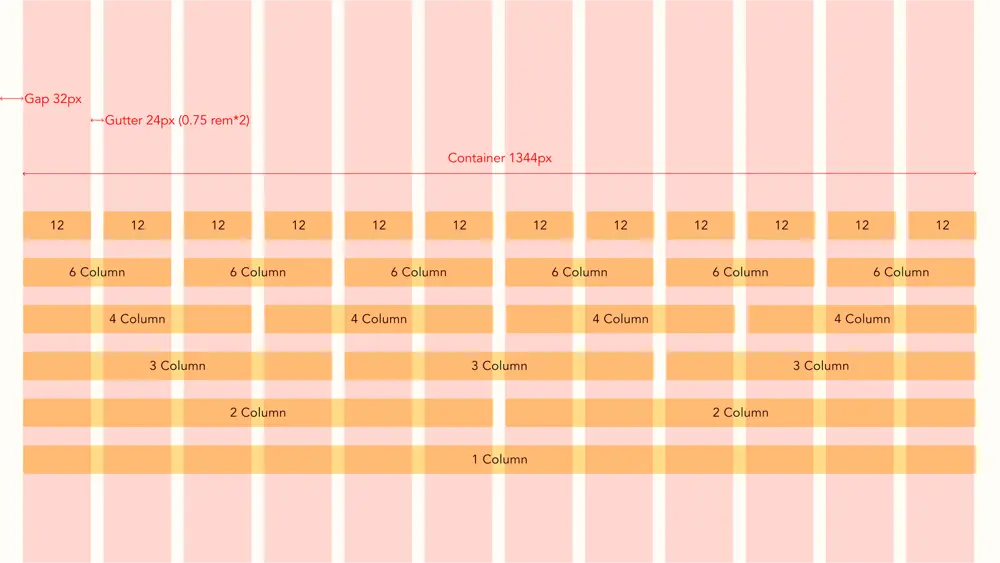
One approach to handling these adaptations is by using a grid layout to structure your web page effectively.
Height
Height impacts what is visible "above the fold" - the content users see without scrolling. When using tools like Figma, it's not always clear what users will initially see on the website. However, this is essential for user retention. Additionally, from a graphic design perspective, the balance of the page can change when only a portion is visible.
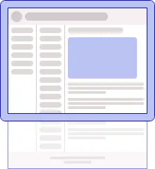
⚠ Keep in mind that on smartphones, the height can change once users start scrolling or when a keyboard appears.
Vertical Rhythm
Much like the grid layout, another typography concept to consider is vertical rhythm. However, implementing this concept can be challenging due to the presence of numerous non-text elements intertwined with text. Additionally, text elements at the same height may be placed within different containers, causing them to flow vertically independently of one another.
Pixel Density
CSS
Screens have varying pixel densities. For example, some screens can render a 0.5px border, while others will round it up to 1px. While this difference may seem minor, it can add up and affect the alignment of elements on the screen.
Images
The srcset attribute is a useful tool for serving different images based on factors like screen size, pixel density, and accepted formats. This ensures that the image displayed is of the right size and quality for the device.
<picture>
  <source
    media="(max-width: 767px)"
    type="image/webp"
    srcset="image-mobile.webp, image-mobile@2x.webp 2x"
  />
  <source
    media="(min-width: 768px)"
    type="image/webp"
    srcset="image-desktop.webp, image-desktop@2x.webp 2x"
  />
  <source
    media="(max-width: 767px)"
    type="image/webp"
    srcset="image-mobile.webp, image-mobile@2x.png 2x"
  />
  <source
    media="(min-width: 768px)"
    type="image/webp"
    srcset="image-desktop.webp, image-desktop@2x.png 2x"
  />
  <img src="fallback.png" alt="image" />
</picture>
The above code has a different image on a viewport below 768px and serves webp and retina images where appropriate.
Contrast
Consider contrast when designing for various screens. Cheaper screens tend to have lower contrast ratios, making it difficult to distinguish between certain colors, especially when looking at a screen at an angle. Tools like Lighthouse in Chrome can help identify contrast issues.
⚠ It's possible that backgrounds, like alternating rows, may not contrast sufficiently with their surroundings. This doesn't impact text legibility, so might not be flagged by these tools.
Text Over a Background Image
When combining responsive web design and text over images, it may happen that at certain widths, the text appears over a part of the image with low contrast. A little trick to improve readability is to use a text shadow.
Subtle shadow:
color: #fff;
text-shadow: 1px 1px 0 rgba(0, 0, 0, 0.5);
More pronounced shadow:
text-shadow: 1px 1px 0 rgba(0, 0, 0, 0.5), -1px 1px 0 rgba(0, 0, 0, 0.5),
  -1px -1px 0 rgba(0, 0, 0, 0.5), 1px -1px 0 rgba(0, 0, 0, 0.5);


Orientation / Aspect Ratio
The user might prefer to view certain types of content, such as graphs, tables, and videos, in landscape mode. In this case, it is crucial to consider that fixed position elements, like the header, leave enough space for the rest of the content.

⚠ If the text size adapts to the view width, using landscape will create a zooming-in effect, which is unlikely to be the intended result of using landscape mode.
Sizing Units
In addition to using pixels for sizing, viewport units offer a dynamic way to define element sizes. Viewport units are percentages of the viewport's width or height and adapt to various window sizes. For cases where the viewport changes dynamically, such as when a user scrolls on a smartphone, small, large, or dynamic units can be used.
⚠ Be cautious when using 100vw, as a vertical scrollbar can reduce the available width, causing content overflow and the appearance of a horizontal scrollbar.
The following is a workaround:
width: calc(100vw - (100vw - 100%));
REM
The rem unit is a flexible way to define sizes based on the font size of the root element. For example, if the root font size is 16px, you can set a paragraph's font size as 1rem, which equals 16px.
html {
  font-size: 16px;
}

p {
  font-size: 1rem;
}
For a fixed design across screen sizes, a combination of viewport width (vw) and rem units can be used. For instance:
html {
  font-size: calc(100vw / 375);
}

p {
  font-size: 16rem;
}
In this case, the paragraph font size will be 16px at a viewport width of 375px and adjust proportionally with changes in the window width. This way it is easy to follow the design and use rem instead of px after all values.
⚠ However, when using rem units, the 100vw workaround unfortunately won't work.
font-size: calc((100vw - (100vw - 100%)) / 375);
Scrolling
When the content exceeds its container's dimensions, it's essential to define the scroll containers and specify their scrolling behavior, such as "normal," "fixed," or "sticky."
Mobile browsers have a scrollbar with the overlay property, a feature not widely available on non-mobile browsers. An alternative solution is the use of scrollbar-gutter; however, as of now, it is not universally supported.
On desktop, vertical scrolling is preferred, since it is easily accessible via the scroll wheel. This allows to have a narrower, more discrete vertical scrollbar. A horizontal scrollbar will need to be larger and more obtrusive, since the scrollbar thumb will need to be used.
On mobile on the other hand, is is advised to limit vertical scrolling to the whole page. When the content exceeds its container, horizontal scrolling can be easily done by swiping.
⚠ In both cases, avoid using infinite scrolling if a footer is present, since it will become unreachable.
⚠ Avoid using two nested vertical scrollbars as it can lead to a confusing user experience. Using the mouse wheel inside such an element will cause an inconsistent scrolling behavior depending on the position of both scroll bars.
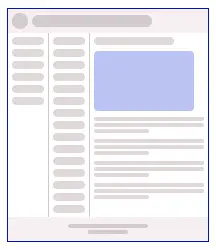
Different Scroll Patterns Based on the Same Design
The following example shows how one design can have a wide array of possible scroll patterns.

Scroll Position
The Intersection Observer API has better performance than checking for the scroll position on scroll and resize. With responsive web design there's the additional benefit that the point at which a certain event is triggered can easily be controlled with an element that is variable in size.
Browser & OS
Fonts
When choosing fonts, keep in mind that every OS has its own system fonts and a font stack is recommended.
To ensure uniformity across different platforms, web fonts can also be used. The fonts can be hosted with the rest of the code. Alternatively, services like Google Fonts provide a convenient way to access a wide variety of fonts. These services often split font files into smaller parts, ensuring that only the necessary font subsets are downloaded. This approach is particularly recommended for extensive font sets, such as Japanese characters, to optimize loading performance.
However, it's worth noting that slight variations in rendering may still occur depending on the browser being used.
The following examples use Google Fonts with a fixed css, but still have slight differences across browsers.
font-size: 24px;
line-height: 1.5;


Graceful Degradation & Progressive Enhancement
Graceful degradation and progressive enhancement are design principles that utilize the latest browser features while maintaining functionality on legacy browsers, at the cost of performance and design variations. It can be applied to both javascript and css features.
For instance, consider the flex box gap property, which is unavailable on browsers earlier than iOS 14.5. This will result in layout differences, but won't disrupt the user experience, and takes less time to implement than the old method.
CanIUse is the reference for assessing browser compatibility.
Tools like Modernizr offer an extensive list of checks to implement in your website, enabling you to handle exceptions in your styling and code effectively.
This approach isn't just limited to browser functionalities; it can also be applied to screen sizes to ensure the layout remains functional on less common sizes, even if it's not pixel-perfect in all cases.
Touch Screens
Designing for different screen types involves considering how users interact with the content.
On conventional screens, hover states can convey information, they are, however, unavailable on touch screens. This distinction must be taken into account when designing user interfaces.
Touch screens on the other hand have other events like swipes and pinches, which aren't available on conventional screens. Also since swiping is used for scrolling, the presence or not of scrollbars doesn't have to be accounted for on mobile designs.
Additionally, touch screen devices offer unique input behaviors, such as keyboard types and select lists. When designing for mobile screens, it's often beneficial to prioritize using native select elements rather than custom-styled ones.
Media Queries
While they are commonly used to adjust styles based on screen width and print, properties such as orientation, resolution, pointer type, hover capability, and many more are available.
When to use media queries and when other solutions are preferred is discussed further in the Design System section of this article.
Component Drive Design
Component Driven Design is a methodology similar to atomic design, where applications are built starting from the smallest components. This approach emphasizes that a component should adapt to its container. Consequently, a web page primarily serves as a container for arranging these components, simplifying the process of achieving responsiveness.
Design Systems
Whether you're using a component library like Material or Ant Design, or creating your own there are 2 possible approaches to responsive web design.
- Use the same style on all sizes and differentiate with properties. e.g. a large button on mobile and a medium one on desktop.
- Different styles separated by media queries. e.g. a large button on all screen sizes, but with a different style.
The second method is preferred since it doesn't rely on javascript and isn't impacted by server side rendering.
As a general rule use media queries when components have a different base design, bug avoid using them for design differences based on the available space.
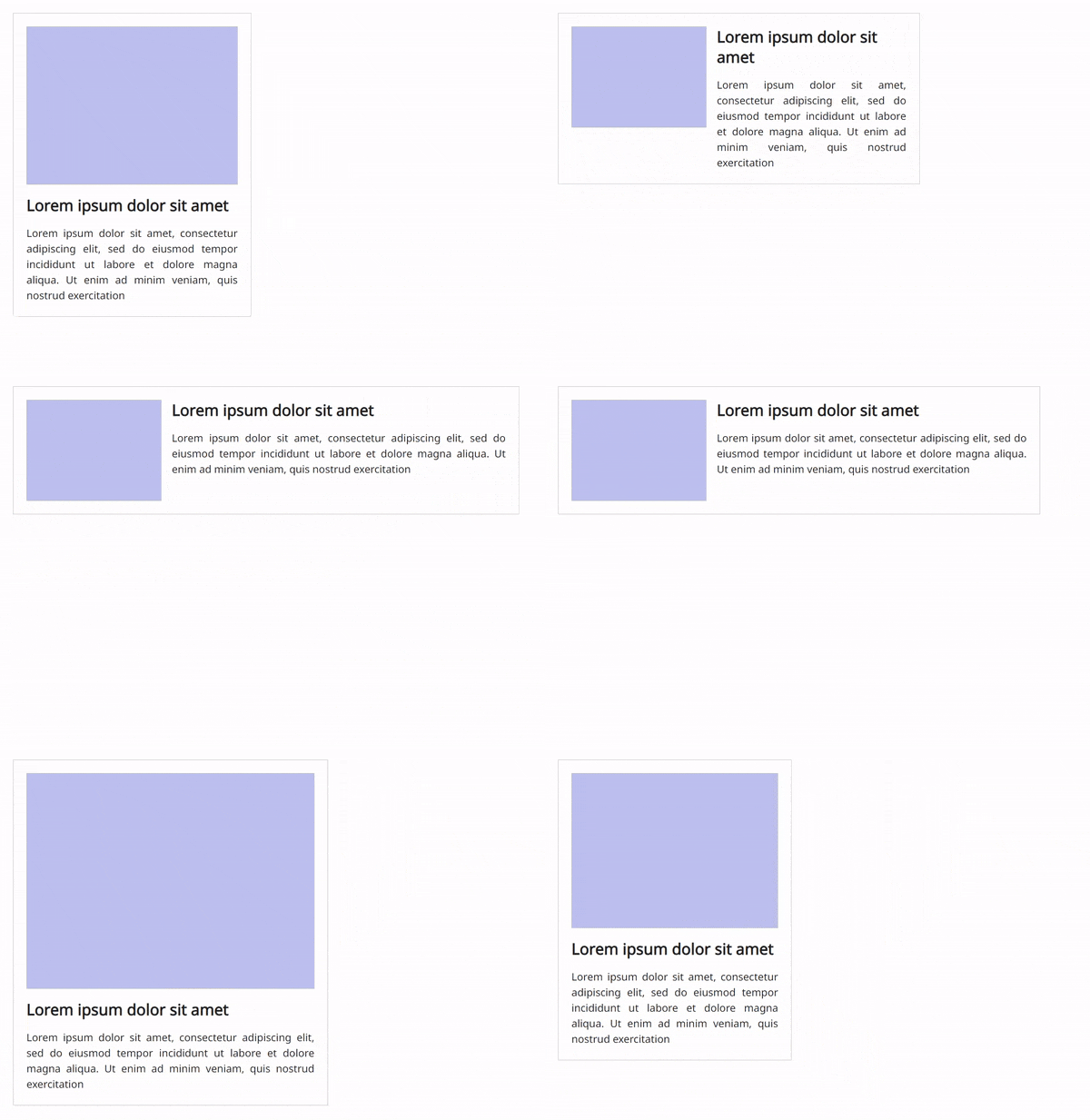
Consider the following case, an article component has an image and text. The image is to the left and the text to the right, but when the width is limited, the image takes the full width and the text comes below it. Since we don't know how much space will be available we can't rely on media queries (its container can have several columns, or there can be a side menu).
Below is an example how this can be solved, using css values like min
<article class="article">
  <div class="article_image_container">
    <img class="article_image" />
  </div>
  <div class="article_text">
    <h1 class="article_title">Lorem ipsum dolor sit amet</h1>
    <p class="article_description">
      Lorem ipsum dolor sit amet, consectetur adipiscing elit, sed do eiusmod
      tempor incididunt ut labore et dolore magna aliqua. Ut enim ad minim
      veniam, quis nostrud exercitation
    </p>
  </div>
</article>
.article {
  display: flex;
  align-content: flex-start;
  /* Wrap allows the text to be next or under the image */
  flex-wrap: wrap;
  padding: 20px;
  width: 100%;
  border: 1px solid #ccc;
  gap: 16px;
}

.article_image_container {
  /*
    With flex the image will grow vertically with the text
    With block there is an extra space below the image
  */
  display: grid;
  /* Width of the image in horizontal layout */
  min-width: 200px;
  flex: 1;
}
.article_image {
  aspect-ratio: 4/3;
  width: 100%;
  background: #ccc;
  border-radius: 16px;
}

.article_text {
  display: flex;
  flex-direction: column;
  flex: 1;
  /*
    If the container is smaller than the image min-width and gap (216px) + 240px
    the text container will be under the image
    If the container is wider, the text will take its full width - (216px)
  */
  min-width: max(240px, calc(100% - 216px));
  gap: 16px;
}

.article_title {
  font-size: 24px;
  line-height: 1.3;
}

.article_description {
  display: flex;
  flex-direction: column;
  text-align: justify;
  font-size: 16px;
  line-height: 1.5;
}
Libraries
Libraries like Material (React, Vue, Angular) and Ant Design form a good basis for medium-sized projects. (They can be a bit heavy for smaller projects and larger projects might benefit more from a tailor-made in-house library).
They've been extensively tested across diverse environments, making them reliable choices for responsive web design.
They can be customized to fit most designs, but the more they're modified, the higher the risk of introducing bugs. It is therefore important to align with the design team at the start of the project, what library to use, and review together what can be customized at what cost.
They have the additional benefit that the components already use best practices. There also is less need for the UI and UX team to define all states and use cases, nor for the developers to implement them from scratch.
Storybook
Storybook, which is a tool for constructing and testing UI components and pages in isolation, and is ideal for Component Driven Design. Additionally, Storybook enables visual testing for different browsers and various viewport sizes.
Accessibility
Accessibility deserves its own in-depth article, but here are some points to consider when implementing responsive web design.
Screen Readers
In the process of implementing responsive layouts, it's sometimes necessary to adjust the order of elements. It's crucial to remember that these changes can also affect the experience of users relying on screen readers as well as SEO.
Font Size
When using font sizes adapting to screen width, make sure that the minimum possible font size is still readable.
p {
  font-size: max(16rem, 12px);
}
Testing Environment
Tools like browserstack can be used for cross-browser and cross-device testing. They're helpful for ensuring web applications function correctly and appear consistent on various browsers, devices, and OS. Additionally, they provide debugging and inspection tools to streamline issue resolution and quality assurance in web development.
Google Analytics
It can be costly and time-consuming to achieve a perfect result across all environments, it is therefore important to prioritize. Google Analytics provides valuable data on the devices, operating systems, and screen sizes that your audience uses. When making decisions about design parameters and testing, analyze this data to help achieve the most efficient coverage.
SEO
Google takes into account mobile-friendliness to rank websites. Since performance is also an important factor, it is crucial to strike the right balance between serving the right content quickly for the right environment, while limiting the burden of having content served for other environments or too many javascript checks when loading the page.
Text Ellipsis
Text ellipsis can be used when text overflows, but scrolling is not desired (small containers like chips or table cells). CSS (ellipsis and line clamp) offers several advantages over a fixed javascript string length, since it adapts to different character and container sizes.
⚠ Make sure that, when using an ellipsis, there is a way for users to visualize the full text. In some cases, the capability to select and copy the full text should also be maintained. This can be an issue with tooltips.
Collaborating With UI & UX Designers
The earlier in the project there is an alignment between the developers and designers, the better. Understanding each other's viewpoints and issues will help the implementation. A common view on the design philosophy and clear initial guidelines will also make it possible for developers to implement the designs without having to burden the designers with creating every possible state and use case for every page and component.
References
- Responsive Web Design (RWD) and User Experience
- Responsive layout grid
- Scrolling and Attention
- 8-Point Grid: Vertical Rhythm
- Mozilla Resources for Developers, by Developers
- An image format for the Web
- Can I use
- Make your website more readable
- The large, small, and dynamic viewport units
- System Font Stack
- Modernizr
- Component Driven User Interfaces
- Storybook
Header, grid and responsive design images by Hanaka Misono


