Welcome to Flutter calculator app tutorial blog for desktop! In this tutorial, I will guide you through the process of creating a fully functional calculator application using Flutter, Google's powerful framework for building cross-platform applications.
Calculators are essential tools that are used by millions of people every day, and by creating a calculator app using Flutter, you'll not only learn the fundamentals of desktop app development but also gain valuable insights into building user-friendly and efficient interfaces.
Throughout this tutorial blog, we will start from scratch and cover all the necessary steps to develop a feature-rich calculator app. We'll assume you have a basic understanding of Flutter, but even if you're new to Flutter, don't worry! I will explain the concepts and code snippets in a beginner-friendly manner.
Our journey will begin by setting up the development environment for Flutter desktop app development. I will guide you through the installation process, ensuring that you have all the necessary tools and dependencies ready to start coding your calculator app.
Next, we'll dive into the design and layout of the calculator user interface. We'll explore various Flutter widgets and layout options to create a visually appealing and intuitive UI for our calculator. You'll learn how to handle user input, process mathematical operations, and display results in real-time.
Throughout the tutorial, we'll focus on best practices for code organization, reusability, and maintainability. You'll learn how to structure your codebase effectively, separate concerns, and utilize Flutter's widget composition model to build a scalable and extensible calculator app.
By the end of this tutorial series, you'll have a solid understanding of how to build a complete calculator application for desktop using Flutter. You'll be equipped with the skills to extend and customize your calculator app further or even venture into building other types of desktop applications.
So, get ready to embark on this exciting journey of Flutter desktop app development, where you'll learn, create, and have fun building your very own calculator app. Let's dive into the world of Flutter!
Setting Up the Development Environment
Enabling Configuration:
Go to your root folder in your project and type in the following command for macOS:
flutter config --enable-macos-desktop
For Linux:
flutter config --enable-linux-desktop
For Windows:
flutter config --enable-windows-desktop
The terminal will ask you to restart; after restarting there would be no changes. Now type the following command in the terminal:
flutter create .
and then run the command:
flutter run -d macos
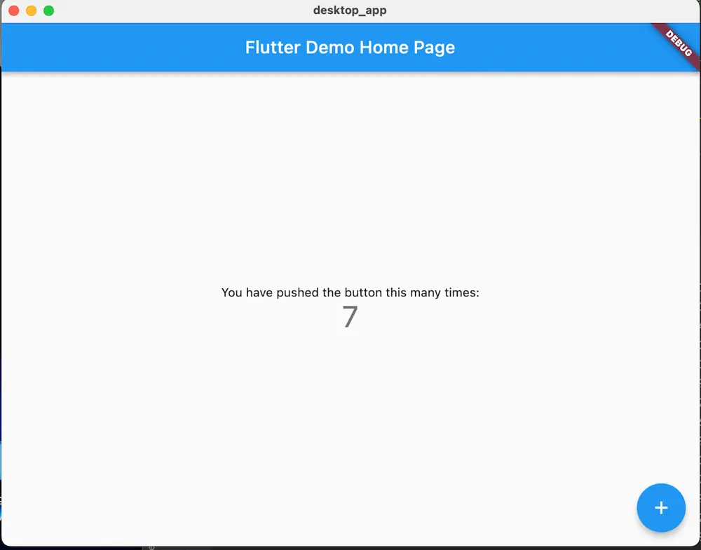
You can replace macos according to your platform Once the command is run, the macos, linux and windows folders are seen and a screen is displayed as below:
Designing the User Interface
The state class
The CalculatorState class represents the state of a calculator in a Flutter application. It contains two properties: input and result.
input: Represents the current input entered by the user in the calculator. It is a String type that holds the user's input, such as numbers, operators, or mathematical expressions.
result: Represents the calculated result based on the user's input. It is also a String type that holds the result of the calculations performed on the input.
The CalculatorState class has a constructor that initializes the input and result properties. The constructor takes optional named parameters input and result, which default to empty strings ('') if not provided.
class CalculatorState {
  final String input;
  final String result;

  CalculatorState({this.input = '', this.result = ''});
}
Button widget
The Button class is a custom Flutter widget that represents a calculator button with customizable properties. Let's go through the different parts of the code to understand its functionality:
-
Properties:
buttonColor: Represents the background color of the button.textColor: Represents the color of the button text.buttonText: Represents the text displayed on the button.buttontapped: Represents a callback function that will be invoked when the button is tapped.
-
Constructor:
- The
Buttonclass has a constructor that takes named parameters:buttonColor,textColor,buttonText: Optional parameters that allow you to customize the button's appearance.buttontapped: A required parameter that takes aVoidCallback, which is a function that doesn't return a value and is called when the button is tapped.
- The
With this Button widget, you can create buttons in your Flutter UI by providing the desired properties, such as buttonColor, textColor, buttonText, and buttontapped callback. This allows you to create reusable buttons with customizable styles and behavior.
import 'package:flutter/material.dart';
class Button extends StatelessWidget {

  final Color? buttonColor;
  final Color? textColor;
  final String? buttonText;
  final VoidCallback buttontapped;

  const Button({
    Key? key,
    this.buttonColor,
    this.textColor,
    required this.buttonText,
    required this.buttontapped,
  }) : super(key: key);

  @override
  Widget build(BuildContext context) {
    return GestureDetector(
      onTap: buttontapped,
      child: Padding(
        padding: const EdgeInsets.all(6),
        child: ClipRRect(
          child: Container(
            decoration: BoxDecoration(
              borderRadius: BorderRadius.circular(56),
              color: buttonColor ?? Colors.grey,
            ),
            child: Center(
              child: Text(
                buttonText ?? '',
                style: TextStyle(
                  color: textColor ?? Colors.black,
                  fontSize: 25,
                  fontWeight: FontWeight.bold,
                ),
              ),
            ),
          ),
        ),
      ),
    );
  }
}
Calculator screen
The list of buttons which will be included in the calculator :
final List<String> buttons = [
'C',
'+/-',
'%',
'DEL',
'7',
'8',
'9',
'/',
'4',
'5',
'6',
'x',
'1',
'2',
'3',
'-',
'0',
'.',
'=',
'+',
];
The following code snippet represents the building of a GridView with buttons inside a Container. Let's break it down:
Container(
  child: GridView.builder(
    itemCount: buttons.length,
    gridDelegate: const SliverGridDelegateWithFixedCrossAxisCount(
      crossAxisCount: 4,
    ),
    itemBuilder: (BuildContext context, int index) {
      if (index == 0) {
        return Button(
          buttontapped: () {},
          buttonText: buttons[index],
        );
      } else if (index == 1) {
        return Button(
          buttonText: buttons[index],
          buttontapped: () {},
        );
      } else if (index == 2) {
        return Button(
          buttontapped: () {},
          buttonText: buttons[index],
        );
      } else if (index == 3) {
        return Button(
          buttontapped: () {},
          buttonText: buttons[index],
        );
      } else if (index == 18) {
        return Button(
          buttontapped: () {},
          buttonText: buttons[index],
          buttonColor: Colors.orange,
          textColor: Colors.white,
        );
      } else {
        return Button(
          buttontapped: () {},
          buttonText: buttons[index],
          buttonColor: isOperator(buttons[index])
              ? Colors.orange
              : Colors.white30.withOpacity(0.3),
          textColor: isOperator(buttons[index])
              ? Colors.white
              : Colors.black,
        );
      }
    },
  ),
),
The below grid view is used to create the Calculator screen:
Container(
  child: GridView.builder(
    itemCount: buttons.length,
    gridDelegate: const SliverGridDelegateWithFixedCrossAxisCount(
      crossAxisCount: 4,
    ),
    itemBuilder: (BuildContext context, int index) {
      if (index == 0) {
        return Button(
          buttontapped: () {},
          buttonText: buttons[index],
        );
      } else if (index == 1) {
        return Button(
          buttonText: buttons[index],
          buttontapped: () {},
        );
      } else if (index == 2) {
        return Button(
          buttontapped: () {},
          buttonText: buttons[index],
        );
      } else if (index == 3) {
        return Button(
          buttontapped: () {},
          buttonText: buttons[index],
        );
      } else if (index == 18) {
        return Button(
          buttontapped: () {},
          buttonText: buttons[index],
          buttonColor: Colors.orange,
          textColor: Colors.white,
        );
      } else {
        return Button(
          buttontapped: () {},
          buttonText: buttons[index],
          buttonColor: isOperator(buttons[index])
              ? Colors.orange
              : Colors.white30.withOpacity(0.3),
          textColor: isOperator(buttons[index])
              ? Colors.white
              : Colors.black,
        );
      }
    },
  ),
),
This code creates a GridView with a dynamically generated list of buttons based on the buttons list. Here's how it works:
-
The
GridView.builderwidget is used to build the grid dynamically based on the number of buttons in thebuttonslist. -
The
itemCountproperty ofGridView.builderis set to the length of thebuttonslist. -
The
gridDelegateproperty is set toSliverGridDelegateWithFixedCrossAxisCountwithcrossAxisCountset to 4, which means there will be 4 buttons per row. -
The
itemBuildercallback is responsible for building each item in the grid. It takes theBuildContextandindexas parameters. -
Inside the
itemBuildercallback, there is a series of conditions to determine the type of button to display based on theindex. -
When
indexis 0, 1, 2, or 3, it represents specific buttons like 'C', '+/-', '%', and 'DEL'. For these buttons, aButtonwidget is created with the corresponding label and an emptybuttontappedcallback. -
When
indexis 18, it represents the '=' button. This button is created with a specific button color (orange) and text color (white). Again, an emptybuttontappedcallback is provided. -
For all other indices, regular buttons are created. The
buttonColorandtextColorare set based on whether the button is an operator or not. TheisOperatorfunction is called to determine this. -
The
buttontappedcallback for all the regular buttons is empty, as specified by() {}. You can replace this with the desired logic to handle button taps.
Overall, this code snippet generates a grid of buttons inside a Container based on the buttons list, with specific customization for certain buttons and dynamic styling based on whether a button is an operator or not.
 bool isOperator(String x) {
    if (x == '/' || x == 'x' || x == '-' || x == '+' || x == '=') {
      return true;
    }
    return false;
  }
The isOperator method is a helper function used to determine if a given button label is an operator (/, x, -, +, =).
It returns true if the button label is an operator, and false otherwise.
The code below is the input space and the result space:
Expanded(
            child: SizedBox(
              child: Column(
                mainAxisAlignment: MainAxisAlignment.spaceEvenly,
                children: <Widget>[
                  Container(
                    padding: const EdgeInsets.all(20),
                    alignment: Alignment.centerRight,
                    child: Text(
                      '',
                      style: const TextStyle(fontSize: 18, color: Colors.white),
                    ),
                  ),
                  Container(
                    padding: const EdgeInsets.all(15),
                    alignment: Alignment.centerRight,
                    child: Text(
                      '',
                      style: const TextStyle(
                          fontSize: 30,
                          color: Colors.white,
                          fontWeight: FontWeight.bold),
                    ),
                  )
                ],
              ),
            ),
          ),
View model
The provided code defines a CalculatorViewModel class, which extends StateNotifier
class CalculatorViewModel extends StateNotifier<CalculatorState> {
  CalculatorViewModel() : super(CalculatorState());
The clear method clears the calculator's input and sets the result to '0'. It updates the state by assigning a new instance of CalculatorState using state = CalculatorState(input: '', result: '0').
  void clear() {
    state = CalculatorState(input: '', result: '0');
  }
The equalPressed method is responsible for evaluating the input expression and updating the state with the calculated result.
- It retrieves the input from the state and replaces 'x' with '*' to match the expression format.
- The expression is then parsed using the Parser class from math_expressions.
- The parsed expression is evaluated using the Expression class and a ContextModel.
- The result is obtained as a double value, converted to a string, and stored in the answer variable.
- Finally, the state is updated with the modified input expression and the calculated result.
  void equalPressed() {
    String finaluserinput = state.input;
    finaluserinput = state.input.replaceAll('x', '*');

    Parser p = Parser();
    Expression exp = p.parse(finaluserinput);
    ContextModel cm = ContextModel();
    double eval = exp.evaluate(EvaluationType.REAL, cm);
    final answer = eval.toString();
    state = CalculatorState(input: finaluserinput, result: answer);
  }
The updateInput method is responsible for appending the given operation (button label) to the calculator's input. It retrieves the current input from the state, concatenates the operation, and assigns the updated input to the input variable. The state is then updated with the modified input while keeping the result unchanged.
void updateInput(String operation) {
var input = state.input;
input += operation;
state = CalculatorState(input: input, result: state.result);
}
The delete method removes the last character from the calculator's input. It retrieves the current input from the state and creates a substring of the input excluding the last character. The modified input is assigned to the finalInput variable. The state is then updated with the modified input while keeping the result unchanged.
  void delete() {
    var input = state.input;
    final finalInput = input.substring(0, input.length - 1);

    state = CalculatorState(input: finalInput, result: state.result);
  }
The CalculatorViewModel class encapsulates the logic for handling button presses, performing calculations, and managing the state of the calculator. It utilizes the state property inherited from StateNotifier to update the state and notify listeners of state changes.
Connecting the UI with the view model
The provided code defines a calculatorProvider using the StateNotifierProvider from the flutter_riverpod package. This provider is responsible for creating and managing an instance of the CalculatorViewModel class and providing access to its associated state of type CalculatorState to other parts of the application.
Here's an explanation of the code:
final calculatorProvider =
    StateNotifierProvider<CalculatorViewModel, CalculatorState>(
  (ref) => CalculatorViewModel(),
);
- The
calculatorProvideris declared as a constant using thefinalkeyword. - It is assigned the result of the
StateNotifierProviderconstructor, which takes two type parameters:CalculatorViewModelandCalculatorState. - The first type parameter,
CalculatorViewModel, specifies the type of the state notifier being provided. In this case, it is an instance of theCalculatorViewModelclass. - The second type parameter,
CalculatorState, specifies the type of the state managed by the state notifier. Here, it is theCalculatorStateclass. - The constructor argument
(ref) => CalculatorViewModel()is a callback function that gets executed when the provider is first accessed. It creates a new instance of theCalculatorViewModelclass and returns it. Therefparameter provides access to the provider's container and can be used to read other providers or perform additional setup.
With the calculatorProvider defined, other parts of the application can access the CalculatorViewModel instance and its associated state using the ProviderContainer or by using the ConsumerWidget or Consumer widget provided by flutter_riverpod. This allows components to interact with the calculator's state and trigger updates based on user interactions or changes in the state.
To acees the state and reflect it in the UI we will add the below in the build function
final viewModel = ref.read(calculatorProvider.notifier);
final state = ref.watch(calculatorProvider);
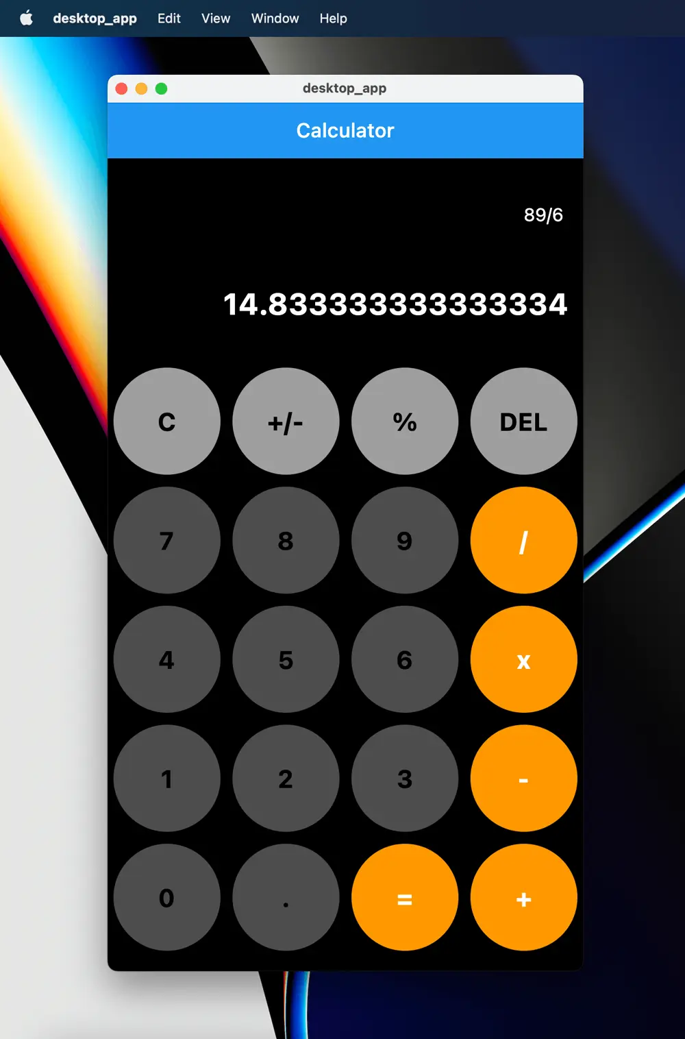
After bulilding and running the project, the final app would look like this:
The full code can be found here: GithubRepo
Article Photo by Moataz Nabil
Author

You may also like
Serverpod for a Weekend - The Good, The Bad, and The Surprising
I've been building Flutter apps professionally for years now, and I've seen the backend landscape evolve from Firebase to Supabase to custom Node.js APIs. Each solution came with trade-offs: Firebase locked you in, Supabase was great until you needed cust...

What I Thought Was People Management Wasn't People Management at All
This article is the 15th entry in the D-Plus🐬 Development Productivity Community Advent Calendar 2025. Day 14's article is... wait, nobody's there??? I had the opportunity to speak at D-Plus in Osaka back in May with a presentation called Task Management...