Classic Android layouts are good for creating general purpose layouts, but when it comes to creating more complex layouts, you might find yourself creating custom views, and with Jetpack Compose it is now easier and more performant than ever to do so.
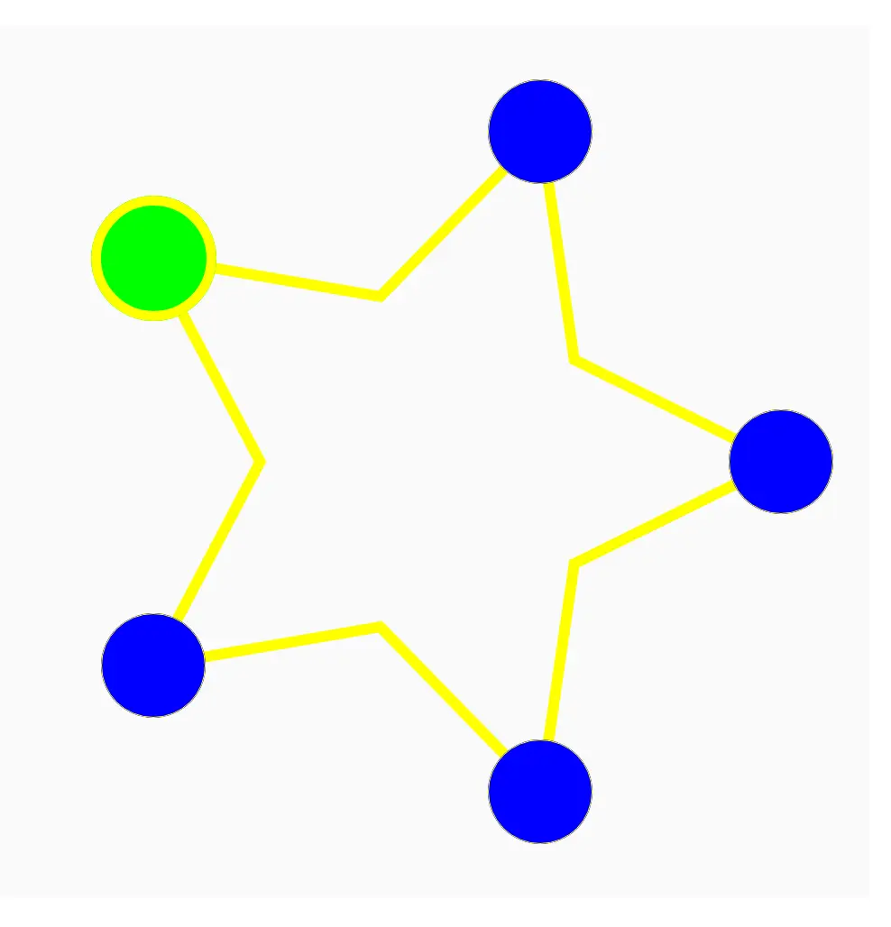
In this article we will use Jetpack Compose to create a star layout, the children of the layout are distributed on the tips of star arms, as shown in the picture below.

A brief overview
Compose goes through 3 phases to draw each frame on the screen:
- Composition: where composable functions run to create a description of the UI.
- Layout: where views are measured and placed.
- Drawing: where each UI element is drawn.
For creating a custom layout our focus will be on (you guessed it) the layout phase. Each node in this phase must go through 3 steps:
- Measure its children
- Decide its own size
- Place its children
We will explain each step as we go through the implementation of the star layout.
To create a custom layout, Compose provides the Layout composable. Layouts like Row and Column also use the Layout composable under the hood.
The StarLayout composable function will take 5 arguments:
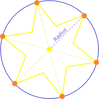
- radius: defines the size of the star and it represents the distance from the center of the star to the tip of one arm.
- modifier: (optional) the modifier that can be passed to this layout to make some tweaks
- drawStyle: (optional) the draw style of the star, it helps us customize the look of the star
- color: (optional) the fill color of the star if the draw style is fill, or the stroke color if the draw style is stroke
- content: a composable that contains the items that will be displayed on the star layout
The code will look like this :
@Composable
fun StarLayout(
   radius: Dp,
   modifier: Modifier = Modifier,
   drawStyle: DrawStyle = Stroke(12f),
   color: Color = Color.Yellow,
   content: @Composable () -> Unit
) {
   var starRadiusPx = with(LocalDensity.current) { radius.roundToPx() }
   var count = 0
   var totalRadius = 0
   var maxChildDiameter = 0
   // Use the Layout composable to create the custom layout
   Layout(
        content = content,
        modifier = modifier
    ) { measurables, constraints ->
        //measure child nodes to get a list of placeables
        val placeables = measurables.map { it.measure(constraints) }
        // set the count variable value to be equal to children count
        count = placeables.size
        // find the diameter of the largest child so we can set the layout size properly
        placeables.forEach {
          val h = it.height.toDouble()
          val w = it.width.toDouble()
          val diameter = sqrt(h * h + w * w)
          if (diameter > maxChildDiameter) maxChildDiameter = diameter.toInt()
        }
        // set the total radius to be the sum of star radius and half the diameter of largest child
        totalRadius = starRadiusPx + maxChildDiameter/2
        // set layout size to be twice the total radius in width and height
        layout(totalRadius * 2, totalRadius * 2) {
            val step = PI * 2 / placeables.size
            var angle = 0.0
            // place child elements
            placeables.forEach {
                it.place(
                    radiusPx - it.width / 2 + (radiusPx * cos(angle)).toInt(),
                    radiusPx - it.height / 2 + (radiusPx * sin(angle)).toInt(),
                )
                angle += step
            }
        }
    }
   }
Measuring children
var starRadiusPx = with(LocalDensity.current) { radius.roundToPx() }
var count = 0
var totalRadius = 0
var maxChildDiameter = 0
We use the starRadiusPx variable to save the radius value in pixels as we will need it later to draw the star, we also declare the count variable to store the count of child elements, which will be later used to draw the star arms.
Furthermore, we declare the totalRadius variable which will be used to set the final layout size, and we use the maxChildDiameter variable to store the diameter of the largest child.
Layout(
        content = content,
        modifier = modifier
    ) { measurables, constraints ->
        //measure child nodes to get a list of placeables
        val placeables = measurables.map { it.measure(constraints) }
        // set the count variable value to be equal to children count
        count = placeables.size
        ..........
Then we use the Layout composable to create our custom layout, which requires three arguments, a content, a modifier, and a measure policy. We pass the content and the modifier, and a lambda expression that Kotlin accepts instead of a MeasurePolicy implementation. Due to the existence of SAM conversions, in the lambda expression, we have measurables, each related to one of the layout children, and we also have constraints that we should consider when measuring the children.
Our StarLayout is not a tough parent, so it allows the measurement of its children to happen without tweaking the constraints. We map the measurables to a list of placeables by measuring each element with the provided constraints. Then we set the value of the count variable to be the size of the measurables.
Setting layout size
placeables.forEach {
  val h = it.height.toDouble()
  val w = it.width.toDouble()
  val diameter = sqrt(h * h + w * w)
  if (diameter > maxChildDiameter) maxChildDiameter = diameter.toInt()
}
// set the total radius to be the sum of star radius and half the diameter of largest child
totalRadius = starRadiusPx + maxChildDiameter/2
Here we find the diameter of the largest child by going through each placeable to measure its diameter. If it is larger than the maximum value we set the maximum value to be equal to it.
And finally, we set the total radius to be equal to the sum of the star radius and half of the diameter of the largest child.
layout(totalRadius * 2, totalRadius * 2) {
We use the totalRadius parameter to set the size of the star, so both width and height will be twice the totalRadius. We set the size of the layout by calling the layout function passing totalRadius*2 as the value for both width and height.
Placing children
.............
 val step = PI * 2 / placeables.size
 var angle = 0.0
 // place child elements
 placeables.forEach {
     it.place(
         totalRadius - it.width / 2 + (starRadiusPx * cos(angle)).toInt(),
         totalRadius - it.height / 2 + (starRadiusPx * sin(angle)).toInt(),
     )
     angle += step
}
If we think about placing the children in the layout we will find that it is like distributing items equally on a circle, the position of each item will be rotated around the center of the circle by an angle equal to 2*PI divided by the children's count.

In math, we get the coordinates of a any given point on a circle by using the following formula: X = R.cos(a), Y = R.sin(a), where R is the radius of the circle, and a is the angle between the X-axis and the line connecting the center of the circle to the given point.
In our case we need to distribute the children equally on the circle, which basically means distributing points equally on a circle, this can be done by using the previous equations while increasing the value of (a) each time by a 2*PI divided by the children count.
We know that in Android the origin of any layout is at the top left corner, so to distribute the children correctly inside the layout we have to offset their coords by the total radius, this way we make sure that the children are distributed equally on a circle which its center is in the center of the layout.
We also need to make sure to place each child in a way where its center is on the circle and not its top left corner, that is why we also have it.width / 2 and it.height / 2.
Drawing the star

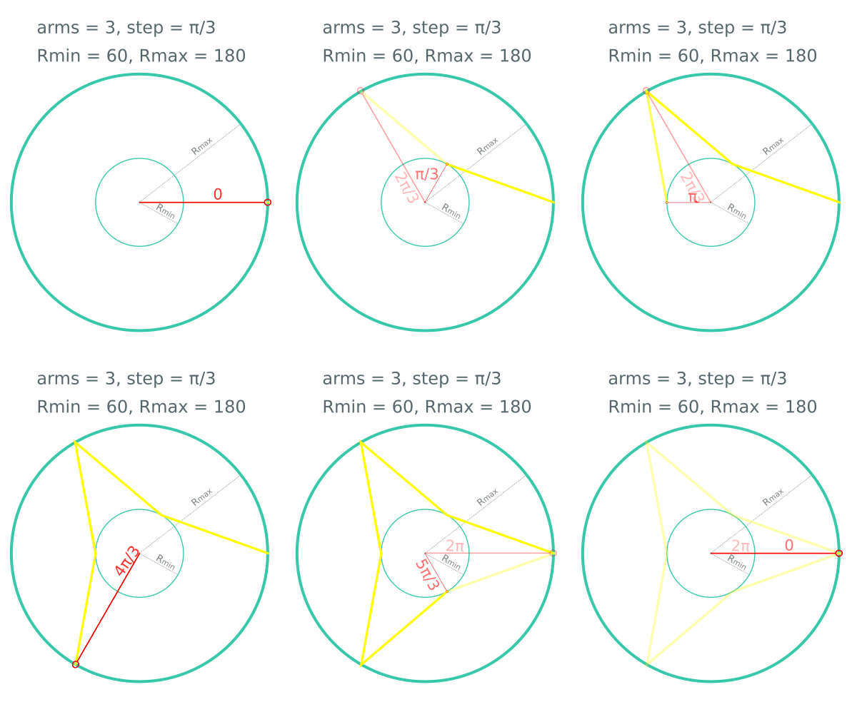
If you check the image above you can see that we can think of drawing a star as connecting points between 2 circles with different radii (Rmax and Rmin), the values of Rmax and Rmin define the shape and size of the star, as you can see we alternate between the 2 circles and we increase the angle by a specific value. It is very similar to the concept of distributing items equally on a circle, but we just alternate the radius each time between the 2 values Rmax and Rmin, while increasing the angle each time.
To draw the star shape we will need to draw a path on the canvas, for creating the star path we will use the following code:
private fun createStarPath(
    maxR: Float,
    minR: Float,
    tipCount: Int,
): Path {
    val path = Path()
    val step = PI / tipCount
    var r = maxR
    var angle = 0.0;
    path.moveTo(2 * maxR, maxR)
    repeat(tipCount * 2) {
        angle += step
        r = if (r == maxR) minR else maxR
        path.lineTo(maxR + r * cos(angle).toFloat(), maxR + r * sin(angle).toFloat())
    }
    path.close()
    return path
}
The previous code is basically an implementation of the idea earlier, maxR is the radius of the larger circle, minR is the radius of the small circle, and tipCount is the count of star tips, which will also help us define the step value. Here we see that the amount of lines drawn is twice the count of the star tips, that is also why the step value is PI / tipCount instead of 2PI / tipCount*.
To draw the star on the canvas we will use the drawWithCache, so let's modify this section of the code:
Layout(
        content = content,
        modifier = modifier
    ) { measurables, constraints ->
to become like this:
Layout(
        content = {StarLayoutScope.content()},
        modifier = modifier
            .drawWithCache {
                onDrawBehind {
                    val maxR = starRadiusPx.toFloat()
                    val minR = maxR*0.5f
                    val path = createStarPath(maxR, minR,count)
                    path.translate(Offset(maxChildDiameter * 0.5f, maxChildDiameter * 0.5f))
                    drawPath(
                        path,
                        color = color,
                        style = drawStyle
                    )
                }
            }
    ) { measurables, constraints ->
We want to draw the star as a background for the layout so we draw it inside onDrawBehind. We set the maxR to be equal to the star radius, we set the minR to be half of maxR, you can tweak this value to get stars with different looks, but for now I will use half of maxR.
Then we create the star path using the function we wrote earlier, and then we offset the path by half of the diameter of the largest child on both the X and Y axis, to make sure to align the star tips with the children's position. We previously added width/2 and height /2 to the position of each child in the Placing children section.
Testing the layout
When you finish implementing a cool feature, you are usually thrilled to present it and get feedback. You might be tempted to care less about how that feature looks, but we will not do that here.
In order to make our work look better and presentable, we will create a nice composable function for the child element:
@Composable
fun StarItem(
    selected: Boolean,
    radius: Dp = 32.dp,
    modifier: Modifier = Modifier,
    content: @Composable () -> Unit
) {

    Box(
        modifier = modifier
            .clip(CircleShape)
            .size(if (selected) radius.times(1.2f) else radius)
            .background(if (selected) Color.Green else Color.Blue)
            .then(
                Modifier.border(if (selected) 4.dp else 0.dp, Color.Yellow, CircleShape)
            )
    ) {

    }
}
This composable function will draw a blue circle if the item is not selected, and a green circle with a yellow border if the item is selected. The important parameters for this function are selected which indicates whether the item is selected or not and radius which defines the radius of the circle.
Now we can use it as an item for our star layout, let's type the following code in MainActivity:
class MainActivity : ComponentActivity() {
    val items = listOf(false, false, true, false, false)
    override fun onCreate(savedInstanceState: Bundle?) {
        super.onCreate(savedInstanceState)
        setContent {
            Star_layout_articleTheme {
                // A surface container using the 'background' color from the theme

                Column(
                    horizontalAlignment = Alignment.CenterHorizontally
                ) {

                    StarLayout(radius = 160.dp) {
                        items.forEach {

                            StarItem(selected = it, radius = 42.dp) {}
                        }
                    }
                }
            }
        }
    }
}
Nothing special here, we just declared a list of Booleans that will represent the items, then we put the StarLayout inside a Column layout. We also set the radius of the layout to 160.dp, then for the layout content we create a starItem for each one of the items providing the selected value and the radius.
You can also access the source code here.
I hope you found this information useful, there are lots of improvements that can be done and cool ideas to add, but I had to stop here because the article is already very long. Hopefully, we can talk about creating custom modifiers for a specific layout in another article soon.
Author

Kamel Mohamad
Android developer


