In the first 2 parts of this series we learned the basics for implementing a [Compositional Layout]({{ site.baseurl }}{% post_url 2020-01-10-Compositional-Layout-Part1 %}) and how to add Supplementary Items and Decorations.
With this knowledge in hand we will now try and recreate the "Apps" screen of the Apple App Store, and see how we can use the first 2 parts to build a UI everyone is familiar with.
Prerequisites:
Download the Starter project from GitHub to code along, you can also download the completed project from the master branch on the same repo.
It is also recommended to have read part 1 and part 2.
Let's have a look at the starter project.
The Starter Project
Here I will quickly go over what has been setup in the starter project and what you should change or do differently when working on an actual project.
Models
The models (App, Category and Section) in this project are pretty straight forward and don't need much explaination.
All of them include the information needed to display it on the screen. One note is that you probably want to change how images are handled, my suggestion is to load them from a url and have a caching system in place.
Then we have one enum, SectionType which defines what styles of sections can be shown in the UICollectionView. These are the styles we are going to make during this tutorial.
Cells and Views
I have setup a SectionHeader view and 4 UICollectionViewCells that resemble the cells used in the App Store. I'm sure Apple has some nice adaptable cells to handle a few of these cases in 1 class but that is out of scope for this tutorial.
Of course if you prefer using Storyboard or Xib files go ahead and use that. It should not have any effect on the Layout we will cover in this tutorial.
I also added an extension on the UICollectionReusableView class to add the identifier property to the Supplementary views and the cells.
AppsPresenter
The AppsPresenter handles all the data and the ViewController will ask it for the data and info it needs to construct the UICollectionView.
This is inspired by the VIPER/CLEAN architecture we use at Nodes but is an (over)simplified version of it. Feel free to use ViewModels, put it in the ViewController or whatever you are comfortable with.
You will need to go in the AppsPresenter to uncomment some of the data but you will not need to change anything else in this file.
The data model is definitely not optimal but hey it's a tutorial for the UI layout so let's ignore that for now. I will point to some other resources at the end of the post for more info on that.
ViewController
Then the last file is the ViewController.swift file where we will be working during the tutorial, I have already wired up the presenter and the UICollectionView so we can focus on the Layout part.
Let's get started
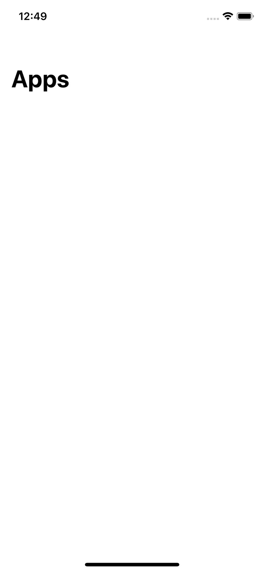
To make sure everything is setup correctly download the starter project and run the project. You should see an empty screen with the "Apps" title.
The featured section
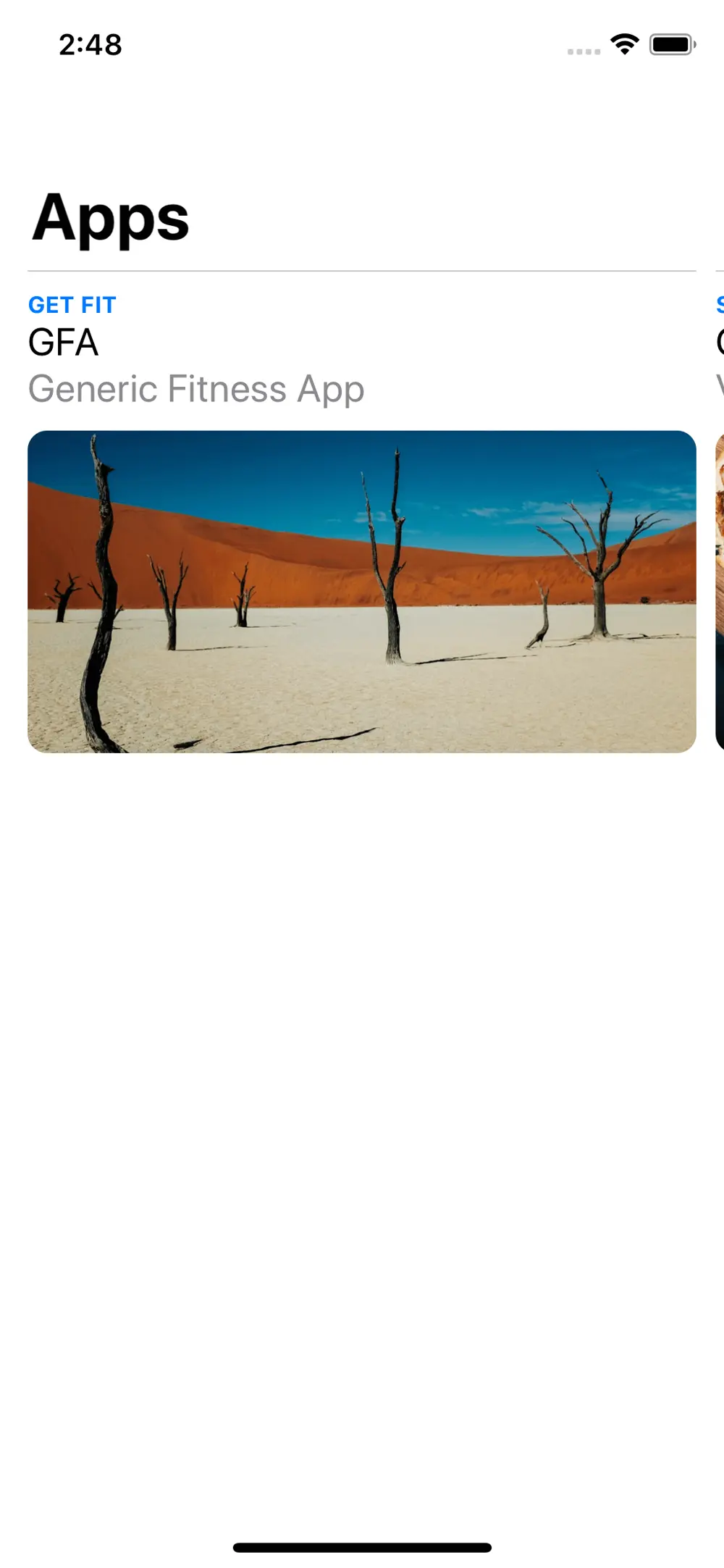
Let's get started with the first section in our App Store, the featured apps you usually find as the first section in the store. I already made the cells so let's have a look at the layout it self.
UICollectionViewCompositionalLayout
On line 29 of the ViewController.swift file you will see the collectionView being initialised with a collectionViewLayout that is created by the makeLayout() function, in this function we will tell the collectionView what layout to use for what section and set some other section level configurations.
Now we can finally start coding, remove the only line in the makeLayout() function so we have an empty function. Then add the following code (always write the code your self in these kinds of tutorials, you will understand the code much better that way).
// 1
let layout = UICollectionViewCompositionalLayout { (sectionIndex: Int, layoutEnv: NSCollectionLayoutEnvironment) -> NSCollectionLayoutSection? in
	 // 2
    return self.createSingleListSection()
}

// 3
let config = UICollectionViewCompositionalLayoutConfiguration()
config.interSectionSpacing = 20
layout.configuration = config

return layout
1 - Here we are creating a new UICollectionViewCompositionalLayout using its initialiser. This initialiser needs a closure which provides us with the sectionIndex and the layoutEnvironment, this closure is called everytime the layoutEnvironment changes (e.g.: rotating from portrait to landscape).
2 - In this closure we check what section we are working with and return the appropriate layout. At this point in the tutorial we are only working with one section style so leave the closure like this for now, we will get back to this closure to add the other section styles but for now this is enough. In the next step we will define the createSingleListSection() method so don't worry about the error.
3 - Then we create a UICollectionViewCompositionalLayoutConfiguration and set its interSectionSpacing, this defines how much spacing the layout will provide between sections, then we assign it to the layout we created above.
Now that the collectionView knows what layout to use for its only section, we need to define that layout.
Single List Section
As you might have noticed we have not defined the createSingleListSection() function so lets get right to it.
// 1
private func createSingleListSection() -> NSCollectionLayoutSection {
	// 2
	let itemSize = NSCollectionLayoutSize(widthDimension: .fractionalWidth(1),
	                                      heightDimension: .fractionalHeight(1))
	// 3
	let layoutItem = NSCollectionLayoutItem(layoutSize: itemSize)
	layoutItem.contentInsets = NSDirectionalEdgeInsets(top: 0, leading: 5, bottom: 0, trailing: 5)

	// 4
	let layoutGroupSize = NSCollectionLayoutSize(widthDimension: .fractionalWidth(0.95),
	                                             heightDimension: .estimated(250))
	// 5
	let layoutGroup = NSCollectionLayoutGroup.horizontal(layoutSize: layoutGroupSize,
	                                                     subitems: [layoutItem])

	// 6
	let layoutSection = NSCollectionLayoutSection(group: layoutGroup)

	// 7
	layoutSection.orthogonalScrollingBehavior = .groupPagingCentered

	return layoutSection
}
If you have read part 1 you should at least be a bit familiar with the classes and what we are defining here, but let's go over them none the less to be sure we know what's going on. (If you need a refresher have a look at part 1 of the series).
1 - We are defining the createSingleListSection function that will return a NSCollectionLayoutSection. We will create similar functions for the other section styles we want to use.
2 - Here we define the item size using the NSCollectionLayoutSize class. We use .fractionalWidth(1) and .fractionalHeight(1) for the width and the height as we want only one item to be shown at the time so 1 item should use 100% of the width and the height, for a list of options you can use here check part 1.
3 - The next step is to use the itemSize we just defined to create the actual NSCollectionLayoutItem by passing in the itemSize to its initialiser. After that we add content insets to the leading and trailing edges to add some spacing between the items.
4 - Here we are defining the group size using the same class we used when defining the item size. This time we tell the LayoutSize that we want the group to take up 95% of the screen by passing in 0.95 in fractionalWidth. We do this to show a little bit of the previous and next items so the user is incentivised to scroll further, then we estimate that the height of the group will be 250, you can play around with this number to see what fits best, I quite like 250 so I'll leave it at that.
5 - Now that we have the group size, and the layout item we can create layout group. As you can see the initialiser requires an array of subitems, because we are only showing 1 type of item we just pass in the layoutItem we created. If you want to show differently sized items add more subitems, for this tutorial we will keep it at this.
6 - Then the same reasoning as step 5, we now have a layout group so we can make a layout section. To do that use NSCollectionLayoutSection initialiser and pass in the layoutGroup.
If you run the app now (you will need to register the Featured cell so check the final step) you will see a vertical list of the featured apps, which is not what we want so let's see how step 7 solves this problem.
7 - To make the section scroll horizontally we will use 1 line of code, by setting the orthogonalScrollingBehavior to .groupPagingCentered.
OrthogonalScrolling means that this section should scroll at right angles to our collection view, meaning that if our collection view scrolls vertically this section will scroll horizontally.
(Check out Paul Hudsons video on UICollectionViewCompositionalLayout (linked below) around minute 24 he explains the different behaviours you can use here).
Final step: in the setupCollectionView() function below the constraints add the following line to register our FeaturedCell.
collectionView.register(FeaturedCell.self,
                        forCellWithReuseIdentifier: FeaturedCell.identifier)
Now run the app and see the featured section in all its glory!
This weeks favorites
In this part we will add our second section style but before we do that we need to modify the makeLayout() function so it can handle multiple section styles.
Multiple section styles
In the closure where we currently only have the return self.createSingleListSection() remove that line and replace it with the code below.
// 1
switch self.presenter.sectionType(for: sectionIndex) {
case .singleList:   return self.createSingleListSection()
// 2
case .doubleList:   return self.createDoubleListSection()
// 3
default: fatalError()
}
1 - In the presenter I added a function that returns what SectionStyle the given section index should use, with this value we can make a switch statement where we can return different layout sections based on that style.
2 - The line above this comment is basically the same as before so I'll leave it as that, but we also added our upcoming style called DoubleList, we will define the self.createDoubleListSection() function next.
3 - Because there are already other styles defined in the SectionType enum we need a default case to handle those for now. We will fill out the switch statement as we go.
Section headers
Before we continue with the double list section we need to add some code so we can add section headers. The featured section didn't need it but all the following section do need it so let's do it first.
Once again I have setup the class for our section headers, we just need to tell the UICollectionView how to show them, to do so add the following function to the ViewController class.
private func createSectionHeader() -> NSCollectionLayoutBoundarySupplementaryItem {
    // 1
    let layoutSectionHeaderSize = NSCollectionLayoutSize(widthDimension: .fractionalWidth(0.95),
                                                         heightDimension: .estimated(80))

    // 2
    let layoutSectionHeader = NSCollectionLayoutBoundarySupplementaryItem(layoutSize: layoutSectionHeaderSize,
                                                                          elementKind: UICollectionView.elementKindSectionHeader,
                                                                          alignment: .top)
    return layoutSectionHeader
}
1 - Here we see our friend NSCollectionLayoutSize again, not much has changed we are just telling it that we think the sections headers have a height of 80 and that it should use 95% of the given size.
2 - Now that we have the section header size we will create the NSCollectionLayoutBoundarySupplementaryItem by passing in:
- the section header size,
- the kind of supplementaryitem it is, in this case it is a header.
- and where to put it, in this case at the top of the section.
And that is all that is needed for the section headers, now let's get to the double list section.
Double List Section
The createDoubleListSection() function is quite similar to the createSingleListSection() so I will go into less depth and just explain any differences.
Add the following function to the ViewController class.
private func createDoubleListSection() -> NSCollectionLayoutSection {
    // 1
    let itemSize = NSCollectionLayoutSize(widthDimension: .fractionalWidth(1),
                                          heightDimension: .fractionalHeight(0.5))

    let layoutItem = NSCollectionLayoutItem(layoutSize: itemSize)
    layoutItem.contentInsets = NSDirectionalEdgeInsets(top: 0, leading: 5, bottom: 0, trailing: 5)

    let layoutGroupSize = NSCollectionLayoutSize(widthDimension: .fractionalWidth(0.95),
                                                 heightDimension: .estimated(165))

    // 2
    let layoutGroup = NSCollectionLayoutGroup.vertical(layoutSize: layoutGroupSize,
                                                       subitem: layoutItem,
                                                       count: 2)
    // 3
    layoutGroup.interItemSpacing = .fixed(8)

    let layoutSection = NSCollectionLayoutSection(group: layoutGroup)
    layoutSection.orthogonalScrollingBehavior = .groupPagingCentered

    // 4
    let layoutSectionHeader = createSectionHeader()
    layoutSection.boundarySupplementaryItems = [layoutSectionHeader]

    return layoutSection
}
1 - The first difference is that we need to change the height for each item, as we want to show 2 items in each group we need to set it to 50% of the group size.
2 - Then when we create the layoutGroup we need to make some changes. We want the group to layout its item vertically so we need to use the .vertical initialiser. We pass in the size and the subitem like we did before, and as we always want 2 items per group we set the count to 2.
3 - Now that we have multiple items in a group we need to set the interItemSpacing on the layoutGroup. We know that we always want 8 spacing between the item so we use the .fixed() option.
If you want the system to calculate how much spacing there is left and use that, use the .flexible() option and pass in an estimate.
4 - Now we come to a concept we saw in part 2, and the reason why we implemented the createSectionHeader() function first.
Here we have the createSectionHeader() function make a section header for us and assign it to the boundarySupplementaryItems property of the layoutSection.
Like last time we need to register the cell class the new Double list is going to use and the section header, so let's add the following lines in the setupCollectionView() function.
collectionView.register(SectionHeader.self,
                        forSupplementaryViewOfKind: UICollectionView.elementKindSectionHeader,
                        withReuseIdentifier: SectionHeader.identifier)
collectionView.register(MediumAppCell.self,
                        forCellWithReuseIdentifier: MediumAppCell.identifier)
If you run the app now, you will just see the Featured section because we still have to add to our dataSource. Go to the AppsPresenter.swift file and uncomment everything from below the "Second section" comment to the "Third section" comment.
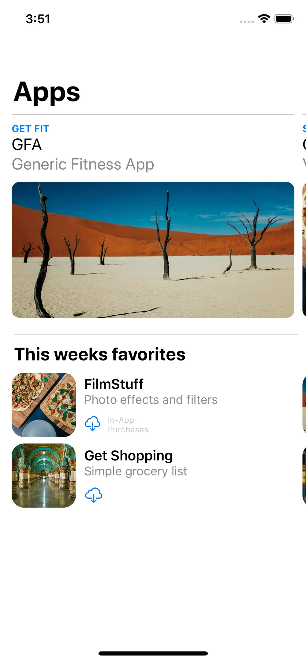
Run the app now and you will see our "This weeks favorites" section.
Learn something
Now that we added the logic for handling multiple section styles and added the createSectionHeader() function, the other sections should be quite easy.
Add a new style
Extend the switch in the makeLayout() function so it looks like this.
switch self.presenter.sectionType(for: sectionIndex) {
case .singleList:   return self.createSingleListSection()
case .doubleList:   return self.createDoubleListSection()
case .tripleList:   return self.createTripleListSection() // new
default: fatalError()
}
Triple List Section
Once again this function will be very similar to the single and double list variants so I will go over the differences between them.
Add the following function to the ViewController class.
private func createTripleListSection() -> NSCollectionLayoutSection {
	// 1
    let itemSize = NSCollectionLayoutSize(widthDimension: .fractionalWidth(1),
                                          heightDimension: .fractionalHeight(0.33))
    let layoutItem = NSCollectionLayoutItem(layoutSize: itemSize)
    layoutItem.contentInsets = NSDirectionalEdgeInsets(top: 0, leading: 5, bottom: 0, trailing: 5)

    let layoutGroupSize = NSCollectionLayoutSize(widthDimension: .fractionalWidth(0.95),
                                                 heightDimension: .estimated(165))
    // 2
    let layoutGroup = NSCollectionLayoutGroup.vertical(layoutSize: layoutGroupSize,
                                                       subitem: layoutItem,
                                                       count: 3)
    layoutGroup.interItemSpacing = .fixed(8)

    let layoutSection = NSCollectionLayoutSection(group: layoutGroup)
    layoutSection.orthogonalScrollingBehavior = .groupPagingCentered

    let layoutSectionHeader = createSectionHeader()
    layoutSection.boundarySupplementaryItems = [layoutSectionHeader]

    return layoutSection
}
As you can see this one is almost identical except for 2 places where some numbers have changed.
1 - The first one is the fraction of the height that changed, instead of half we only want to use a third of the height for each item so was pass in 33% or 0.33
2 - This one is very obvious, because we want 3 item in the group instead of 2, we change the count from 2 to 3.
(note: As I already mentioned a few times there is so little difference i made a more generic method where you give the groupCount and the estimated height and the rest is handled. That will be in the bonus section of this post)
Then the last 2 steps just like we did in the other sections.
- Register the
SmallAppCell
collectionView.register(SmallAppCell.self,
                        forCellWithReuseIdentifier: SmallAppCell.identifier)
- Go to the
AppsPresenter.swiftand uncomment from the "Third section" comment to the "Forth section" comment
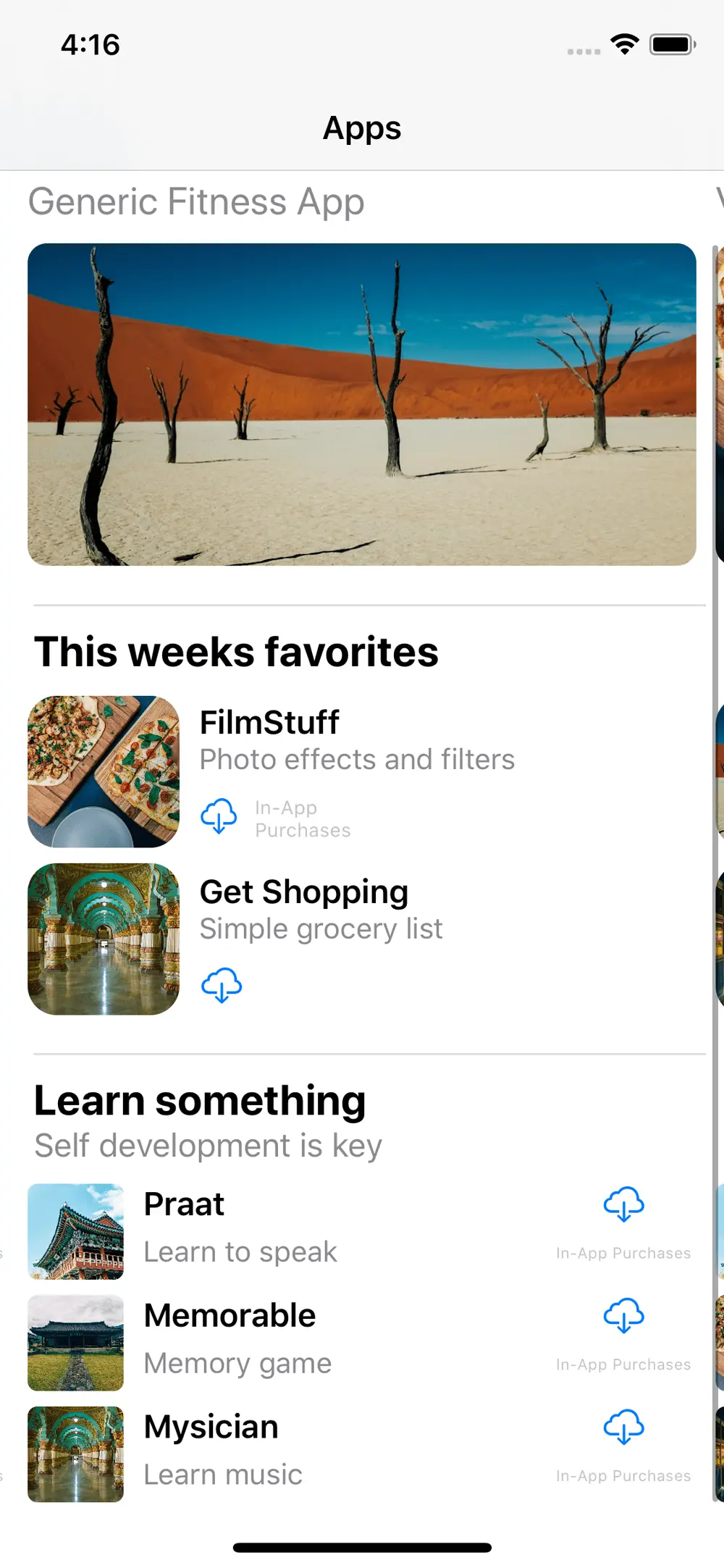
Run your app and you should see the "Learn something" section with 3 items per group.
Top Categories
Here we are, the last section we will cover in this post. We will switch from apps to categories and make a simple list of the top categories of the last month.
Another new style
Extend the switch in the makeLayout() function so it looks like this.
switch self.presenter.sectionType(for: sectionIndex) {
case .singleList:   return self.createSingleListSection()
case .doubleList:   return self.createDoubleListSection()
case .tripleList:   return self.createTripleListSection()
case .categoryList: return self.createCategoryListSection(for: self.presenter.numberOfItems(for: sectionIndex)) // new
}
We removed the default case as we are handling all the defined styles.
The createCategoryListSection needs an amount of items so we ask the presenter how many need to be shown.
Category List Section
A few more changes in this createCategoryListSection(for amount: Int) than the previous ones, so let's have a look.
private func createCategoryListSection(for amount: Int) -> NSCollectionLayoutSection {
    // 1
    let itemSize = NSCollectionLayoutSize(widthDimension: .fractionalWidth(1),
                                          heightDimension: .fractionalHeight(CGFloat(1/amount)))
    let layoutItem = NSCollectionLayoutItem(layoutSize: itemSize)

    // 2
    layoutItem.contentInsets = NSDirectionalEdgeInsets(top: 0, leading: 20, bottom: 0, trailing: 5)

    // 3
    let layoutGroupSize = NSCollectionLayoutSize(widthDimension: .fractionalWidth(0.95),
                                                 heightDimension: .estimated(CGFloat(40 * amount)))
    // 4
    let layoutGroup = NSCollectionLayoutGroup.vertical(layoutSize: layoutGroupSize,
                                                       subitem: layoutItem,
                                                       count: amount)
    layoutGroup.interItemSpacing = .fixed(8)

    let layoutSectionHeader = createSectionHeader()

    let layoutSection = NSCollectionLayoutSection(group: layoutGroup)
    layoutSection.boundarySupplementaryItems = [layoutSectionHeader]

    return layoutSection
}
1 - Here we calculate the item height because we want to decide how many items are shown without the section being to small or to large.
2 - Because this section will not scroll horizontal we will not use the orthogonalScrollingBehavior this means we need to compensate for the spacing that behaviour provided by using 20 instead of 5 as the leading content inset.
3 - Once again here we need to calculate the estimated height for the group as we are showing all cells in 1 group. We estimated that 1 item should have a height of 40 so we multiply 40 by the given amount of items.
4 - Lastly we need to set the amount as the count of the layout group, because this function can handle lists of different lenghts.
Then the last 2 steps just like we did in the other sections.
- Register the
SmallCategoryCell
collectionView.register(SmallCategoryCell.self,
                         forCellWithReuseIdentifier: SmallCategoryCell.identifier)
- Go to the
AppsPresenter.swiftand uncomment from the "Fourth section" comment to the end of the initialiser
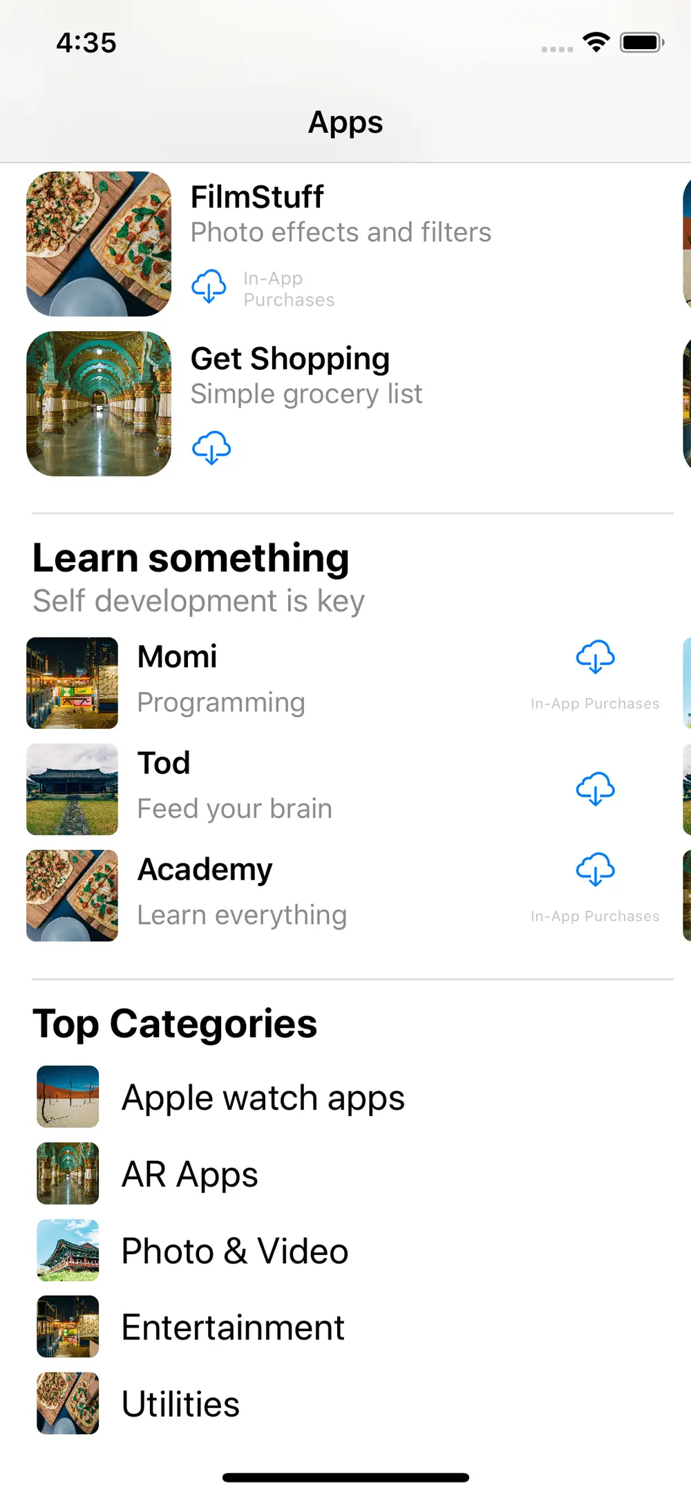
Run your app and you should see the "Top Categories" section with a list of 5 categories.
(If you add or remove some categories in the AppsPresenter you will see how it automatically adjusts the height of the section.
Conclusion
And there we have it, a recreation of the Apple App Store "Apps" screen.
The UICollectionViewCompositionalLayout has made it so much easier to construct complex collection views like this one, and it allows more freedom in designing your apps layout.
We at Nodes are looking forward to see what our designers can come up with now that they can get more creative with their list/grid designs.
Thank you for reading!
Credits
The main inspiration for this part was Paul Hudson's video on UICollectionViewCompositionalLayout.
I highly recommend watching this video as it uses the new UICollectionViewDiffableDataSource as the collection view data source and goes more in depth on certain topics.
This project is smilar to his although I tried to make it a bit more beginner friendly and try to cover some other topics.
This last part was written by Bob De Kort, taking over from Andrei Hogea who wrote part 1 and 2 (See below for author information). Thanks to Andrei for starting the series and giving me a good base to work from.
References
- WWDC 2019 - Advances in Collection View Layout
- Compositional Layout Objects Docs
- Header photo by Vinicius Amano
- Part 1
- Part 2
Bonus
Generic List Layout Function
This works quite well although if you don't give enough space the layout in the cells will break. You could also pass in the item height and multiply that by the group count to get the estimated group height so that the cells don't break.
private func createXListSection(groupCount: Int, estimatedHeight: CGFloat) -> NSCollectionLayoutSection {
    let itemSize = NSCollectionLayoutSize(widthDimension: .fractionalWidth(1),
                                          heightDimension: .fractionalHeight(CGFloat(1/groupCount)))
    let layoutItem = NSCollectionLayoutItem(layoutSize: itemSize)

    layoutItem.contentInsets = NSDirectionalEdgeInsets(top: 0, leading: 5, bottom: 0, trailing: 5)

    let layoutGroupSize = NSCollectionLayoutSize(widthDimension: .fractionalWidth(0.95),
                                                 heightDimension: .estimated(estimatedHeight))
    let layoutGroup = NSCollectionLayoutGroup.vertical(layoutSize: layoutGroupSize,
                                                       subitem: layoutItem,
                                                       count: groupCount)
    layoutGroup.interItemSpacing = .fixed(8)

    let layoutSection = NSCollectionLayoutSection(group: layoutGroup)
    layoutSection.orthogonalScrollingBehavior = .groupPagingCentered

    let layoutSectionHeader = createSectionHeader()
    layoutSection.boundarySupplementaryItems = [layoutSectionHeader]

    return layoutSection
}


