The previous part of this series covered the ground base for implementing a Compositional Layout.
Now that we are comfortable with the base implementation, this part of the series will focus on the Supplementary Items and Decorations that we can use in a Compositional Layout and the way to implement them.
Prerequisites:
This post contains specifics to describe Compositional Layout implementation. Be sure to download our starter project to follow along.
Suplementary Items
Supplementary Items implementation was redefined, now allowing us to anchor them to an item or a group, thus NSCollectionLayoutSupplementaryItem's became more versatile and their implementation became simpler.
NSCollectionLayoutSupplementaryItem's position is now defined relative to its host geometry by making use of NSCollectionLayoutAnchor's.
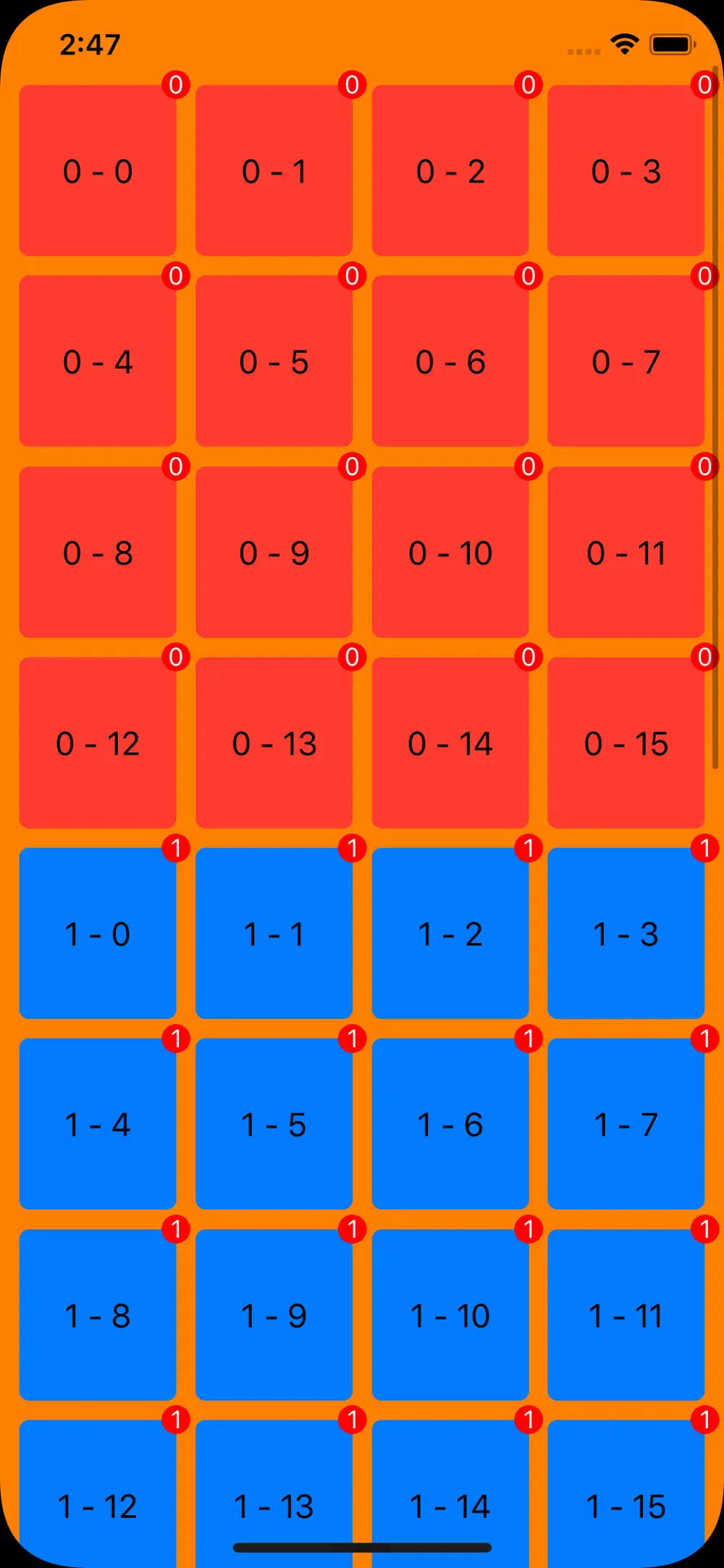
Creating a Badge
Since a NSCollectionLayoutSupplementaryItem became more versatile and we can achor it to an item, creation of badges for each item in the collection view becomes possible.
To showcase the implementation of badges, we will reuse the grid layout we have created in part 1 of this series, but first, we will need to create the badge item. To do so we are going to create a new function func makeBadge() -> NSCollectionLayoutSupplementaryItem that will create for us the supplementary item we will add to our item.
func makeBadge() -> NSCollectionLayoutSupplementaryItem {
        // 1
        let anchor = NSCollectionLayoutAnchor(edges: [.top,
                                                      .trailing],
                                              fractionalOffset: CGPoint(x: 0.5, y: -0.5))
        // 2
        let size = NSCollectionLayoutSize(widthDimension: .absolute(15),
                                          heightDimension: .absolute(15))
        // 3
        let badge = NSCollectionLayoutSupplementaryItem(layoutSize: size,
                                                        elementKind: "badge",
                                                        containerAnchor: anchor)
        return badge
    }
1 - Here we define an NSCollectionLayoutAnchor for our badge. By specifying [.top, .trailing] we position our badge in the top right corner of the parent, while the fractionalOffset positions our badge's center in the the corner. A fractionalOffset of .zero would possition the whole badge inside the parent.
2 - As encountered before, we need to create a size for our item, so here we specify that we our badge should have a fixed value for width and height.
3 - We initialise our NSCollectionLayoutSupplementaryItem by assigning it the size, the anchor and an elementKind, based upon which we will identify our badge in collectionView:viewForSupplementaryElementOfKind:atIndexPath:.
Now that we have our badge ready, we just need to assign it to our items. To do so just replace NSCollectionLayoutItem initialiser in our func makeLayout with the following:
// 1
let item = NSCollectionLayoutItem(layoutSize: itemSize, supplementaryItems: [makeBadge()])
1 - Here we create the item for our layout and assign it the NSCollectionLayoutSupplementaryItem badge.
Run your code and you should see the following result:
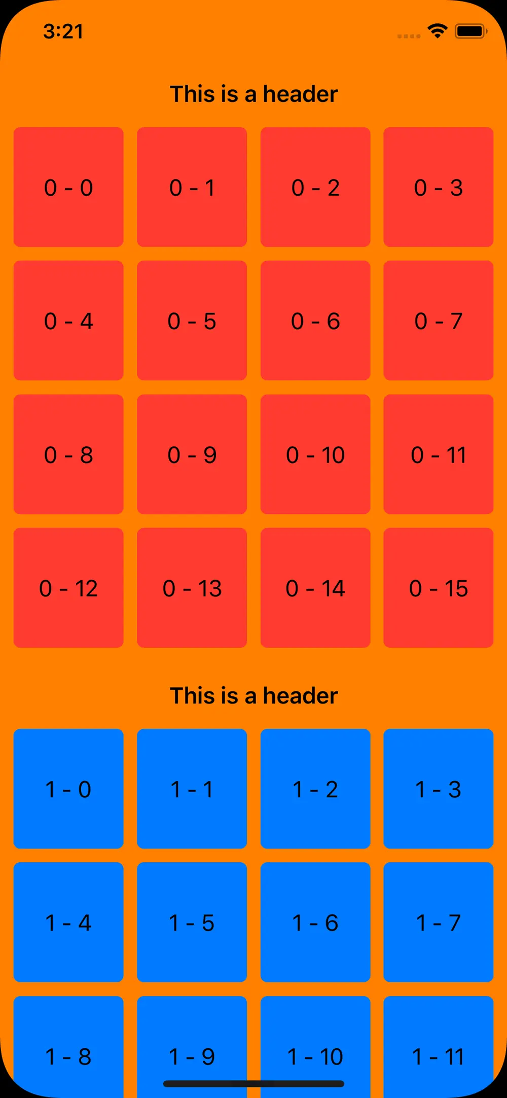
Creating a Header
Previously, in our collection views, we could have encountered difficulties when trying to create and position header views. For example in a UICollectionViewFlowLayout the header would follow the same direction as the layout, making it impossible to use a supplementary view, if we would have liked our header to be above the content in a horizontal scrollable collection view. This is no longer the case because of the newly introduced NSCollectionLayoutAnchor, which allows us to possition our header anywhere in the parent.
For our header we will create an NSCollectionLayoutBoundarySupplementaryItem, that, similarly to a badge, we can anchor the way it better fits our needs.
So let's go ahead and create a function that will make our header.
func makeHeader() -> NSCollectionLayoutBoundarySupplementaryItem {
        // 1
        let size = NSCollectionLayoutSize(widthDimension: .fractionalWidth(1),
                                          heightDimension: .estimated(50))
        // 2
        let header = NSCollectionLayoutBoundarySupplementaryItem(layoutSize: size,
                                                                 elementKind: "header",
                                                                 alignment: .top)
        return header
	}
1 - Assign a size for our header. This will have the parent's width and an estimated height of 50, that will allow for font scaling if needed.
2 - We initialise our NSCollectionLayoutBoundarySupplementaryItem by assigning it the size, the anchor and an elementKind, based upon which we will identify our badge in collectionView:viewForSupplementaryElementOfKind:atIndexPath:.
Now that we have our header, in our func makeLayout we need to pin it to our section. To do so add the following after the section initialisation code.
// 1
section.boundarySupplementaryItems = [makeHeader()]
1 - We assign the header as one of our section's boundarySupplementaryItems.
Run your code and you should see the following result:
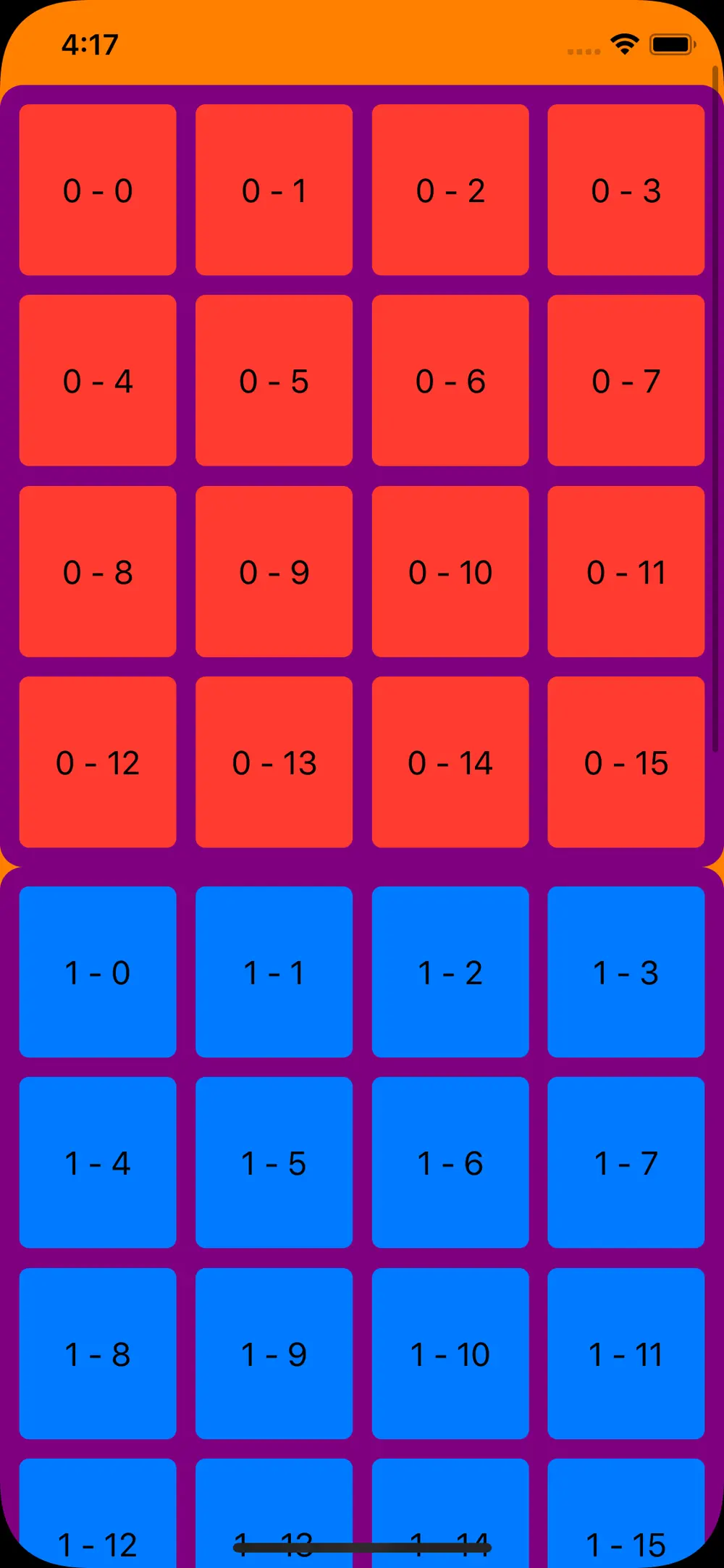
Decoration Items
A new design feature we started seeing a lot in iOS 13 is the new "Card Design". When implementing this type of design it could come in handy if we can set a specific background to a section. This is now possible because of the introduction of NSCollectionLayoutDecorationItem.
Let's start by creating a function that will make our background decoration item.
func makeBackgroundDecorationItem() -> NSCollectionLayoutDecorationItem {
        let backgroundItem = NSCollectionLayoutDecorationItem.background(elementKind: "background")
        return backgroundItem
    }
Now to be able to assign our NSCollectionLayoutDecorationItem to our layout we will need to add the following code in our func makeLayout().
...
	// 1
    section.decorationItems = [makeBackground()]
...
	// 2
    layout.register(BackgroundDecorationView.self,
                    forDecorationViewOfKind: "background")
...
1 - Assign our decoration item to the section.
2 - Register the UICollectionReusableView we will use for our background item with the layout. This will be dequed automatically.
Run your code and you should see the following result:
Final notes
Compositional Layouts redefined the way we can build and design our layout by making it easier to implement suplemenraty items and introducing the concept of decoration items.
To learn more about Compositional Layout's advanced features be sure to check out part 3 of these tutorial series.
Hope to see you next time!
References:
Author

You may also like
RAG: From Concepts to a Bedrock + OpenSearch Serverless Build
Large Language Models are extraordinary generalists, but they fail predictably in two cases: when asked about information they have not seen during training, and when that information has changed since their cut-off date. Fine-tuning, the practice of furt...

Serverpod for a Weekend - The Good, The Bad, and The Surprising
I've been building Flutter apps professionally for years now, and I've seen the backend landscape evolve from Firebase to Supabase to custom Node.js APIs. Each solution came with trade-offs: Firebase locked you in, Supabase was great until you needed cust...