With the arrival of Android 10, the latest trend in Android development is giving the users the choice to select a dark version of the app. Some say it can help save battery life and some just prefer it because it is easier on the eyes when the user opens the app in a dark room or at night for example. Whatever reason you prefer, here's a quick walk through on how to implement it.
Getting Started
The quickest and easiest way to get started with the dark theme is forcing it on the style. This will only work on Android 10, where the system will override the app colors and try to make it dark. This can work nicely for simple apps, but it might mess the app if it has a complex visual.
Note that doing this the dark mode will only work on Android 10 and it won't have backward compatibility as the previous versions of Android can't handle the dark mode natively.
Forcing the Dark Theme
Add this to your Theme in the style.xml:
<item name="android:forceDarkAllowed" tools:targetApi="q">true</item>
Examples
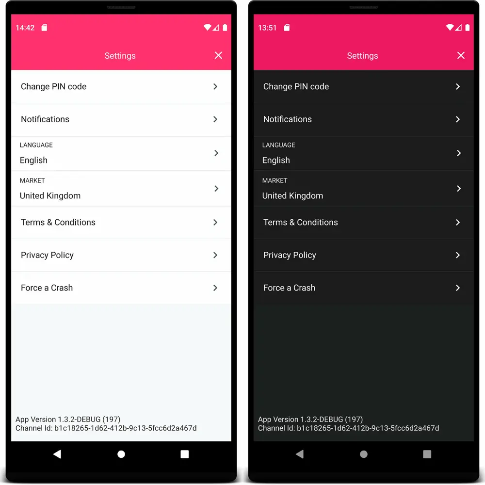
Here are some examples where we let the system handle the dark mode:

Possible problems
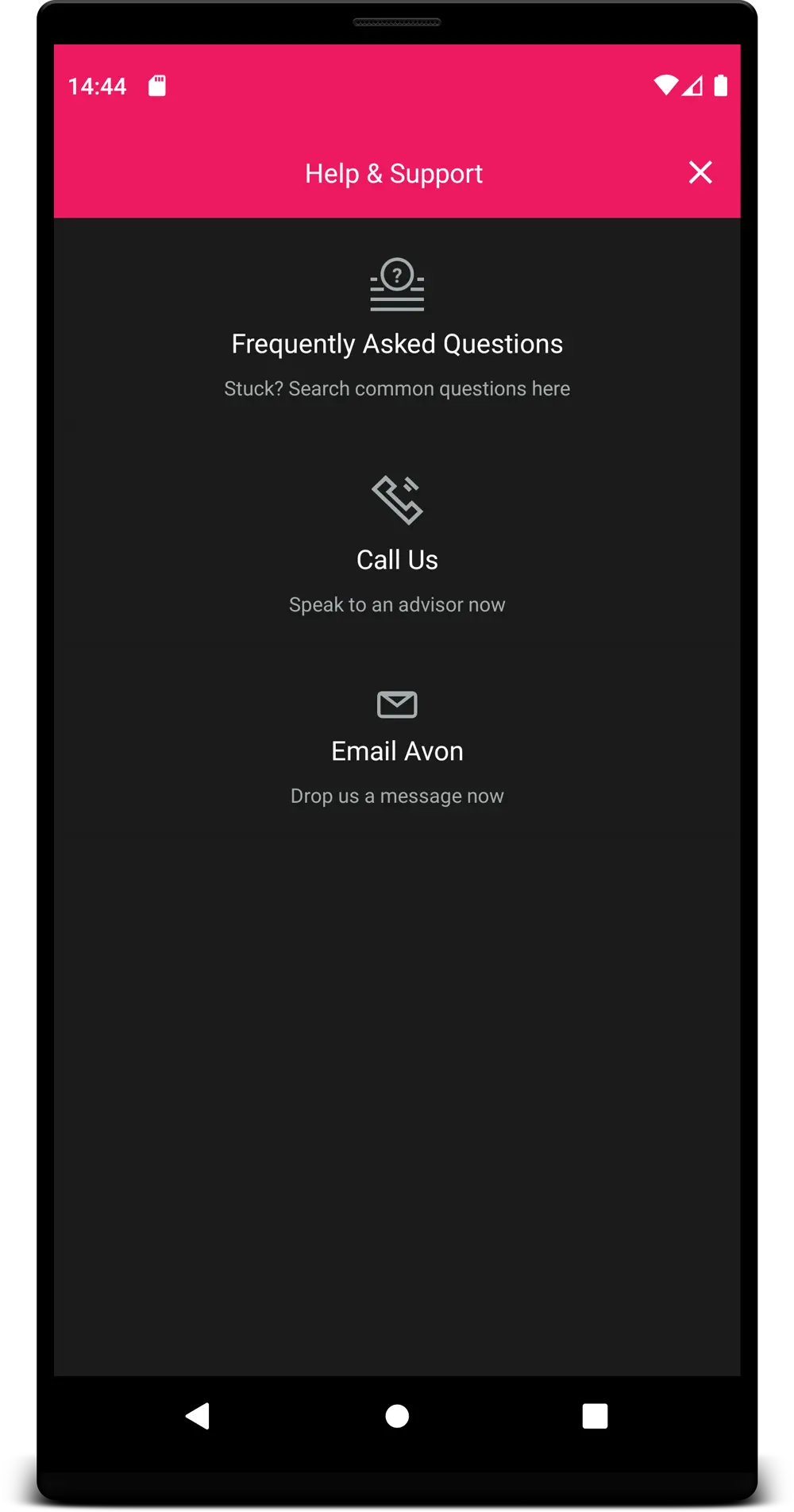
You can see in the previous screenshots that it worked quite well. But in some cases it's not ideal, like the following example where the options are showing but you can barely see the card background for each button:
When forcing the dark theme, you can also specify in the xml for a specific element to not be styled as dark using the following tag:
<View
    ...
    android:forceDarkAllowed="false"
    .../>
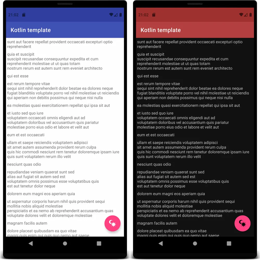
This is a example with the dark mode forced on the theme and adding the ignore tag on the card element:

You can see that everything became dark but the card keep the original background and text colors.
Supporting Dark Theme
To properly support the dark theme you first need to add the DayNight style as parent of your app theme:
<style name="AppTheme" parent="Theme.AppCompat.DayNight">
or the proper theme from MaterialComponents' :
<style name="AppTheme" parent="Theme.MaterialComponents.DayNight">
After this simple change you can start handling the dark mode state on the app.
I've created this simple class to ease the task of switching themes, you can check it here.
So using it to change the theme is as easy as: ThemeHelper.applyTheme(Theme.DARK).
Don't forget to store the user preference of the theme, as the system doesn't store it,
you have to manually handle the states. The best place to apply the user
theme preference is in the Application class of the app, so when the views
are rendered the system already uses the proper theme resources.
Handling Dark Theme
If you want your app theme to follow the system settings, you have to be aware if there is a configuration change and properly handle the screens in your app so it doesn't lose data when it gets recreated.
For handling the activity recreation you need to add a config change
param in the AndroidManifest.xml for you activity, like this:
<activity
    android:name=".MyActivity"
    android:configChanges="uiMode" />
After that you can override the onConfigurationChanged() method in the
activity to handle and save the state when the user or the system switch
the system-wide theme.
Take care that, when supporting a dark theme, you shouldn't hardcode colors,
especially for background as it can look out of place in one of the themes.
Instead, you can set colors for the light theme (default folder) and
override the colors that don't look nice for the dark theme creating a
colors.xml in the night folder. Like this:
../src/main/res/values/colors.xml
<resources>
    <color name="colorPrimary">#3F51B5</color>
    <color name="colorPrimaryDark">#303F9F</color>
    <color name="colorFabIcon">#FFFFFF</color>
</resources>
../src/main/res/values-night/colors.xml
<resources>
    <color name="colorPrimary">#B53F3F</color>
    <color name="colorPrimaryDark">#9F3030</color>
    <color name="colorFabIcon">#000000</color>
</resources>
And here is how it looks like:
With the Material Components library the system already provides some useful
resources to help you apply the dark theme to elements, like android:colorBackground
that automatically changes based on the app theme you apply.
You can read more about it here.
Dark All the Things
Implementing dark mode is not as hard as it looks. With some small state and color handling it is possible to create an app that looks good on both themes. Some people still prefer the light mode, so it's always nice to have the option to switch and let the users chose way they prefer.
Further Reading
Android Developers - Dark theme
Dark Theme - Material Components
Article Photo by Rami Al-zayat
Author

Tiago Araujo de Souza
Android Developer
You may also like
Serverpod for a Weekend - The Good, The Bad, and The Surprising
I've been building Flutter apps professionally for years now, and I've seen the backend landscape evolve from Firebase to Supabase to custom Node.js APIs. Each solution came with trade-offs: Firebase locked you in, Supabase was great until you needed cust...

What I Thought Was People Management Wasn't People Management at All
This article is the 15th entry in the D-Plus🐬 Development Productivity Community Advent Calendar 2025. Day 14's article is... wait, nobody's there??? I had the opportunity to speak at D-Plus in Osaka back in May with a presentation called Task Management...