Complications are bits of watchOS application that can be put on the user's watch face and offer quick information, simply by looking at his/her Apple Watch, without opening the accompanying watchOS/iOS app. The Apple Watch ships with some default complications: Calendar, Weather, Activity, Battery (it shows only the watch’s battery level), etc.
There are 5 complication families. This article will show how to make 7 types of complications, from each complication family. 2 of the shown complications are only available in watchOS 5, and only on the Apple Watch Series 4 and up.
Recently, I had the chance to play with watchOS complications. This led me on a learning path.
There is a goodie at the end of the article :)
Before starting, I would like to point out a series of links that turned out to be useful on the subject of watchOS complications:
The examples that follow will show how to achieve one flavour for each of the complication family.
We start off with:
Circular Small
circularSmall.textProvider = CLKSimpleTextProvider(text: "")
circularSmall.fillFraction = Float()
circularSmall.ringStyle = CLKComplicationRingStyle.closed
The snippet creates a closing ring, with a string in the middle.
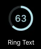
The fillFraction takes values between 0.0 and 1.0. The closer the value is to 1.0, the more closed the ring is.
This complication can be used in the Color watch face.
Extra Large
let extraLarge = CLKComplicationTemplateExtraLargeRingText()
extraLarge.textProvider = CLKSimpleTextProvider(text: "")
extraLarge.fillFraction = Float()
extraLarge.ringStyle = CLKComplicationRingStyle.closed
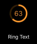
The snippet creates a closing ring, with a string in the middle. The fillFraction takes values between 0.0 and 1.0. The closer the value is to 1.0, the more closed the ring is.
This complication can be used in the X-Large watch face
Graphic Circular
Graphic Circular is one of the new complications introduced in watchOS 5 and only available on the Apple Watch Series 4 and up.
let graphicCircular = CLKComplicationTemplateGraphicCircularOpenGaugeRangeText()
graphicCircular.centerTextProvider = CLKSimpleTextProvider(text: "")
graphicCircular.leadingTextProvider = CLKSimpleTextProvider(text: "")
graphicCircular.trailingTextProvider = CLKSimpleTextProvider(text: "")
graphicCircular.gaugeProvider = CLKTimeIntervalGaugeProvider(style: .ring, gaugeColors: [Array of UIColors], gaugeColorLocations: nil, start: startDate, end: endDate)
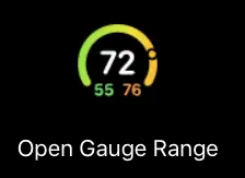
The center text is the text that will be in the "middle" of the ring. The leading text will be in the bottom left of the ring, while the trailing text will be in the bottom right.
The gauge can be either filled-style or ring-style. In the above example, the ring-style is chosen. Depending on the start date and the end date provided, it will have a small circle that will move along the gauge.
The gaugeColors parameters has to be given an array of colors. If you provide gaugeColorLocations with a nil value, watchOS will place the colors in an even out manner.
Graphic Rectangular
Graphic Rectangular is one of the new complications introduced in watchOS 5 and only available on the Apple Watch Series 4 and up.
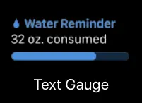
let graphicRectangular = CLKComplicationTemplateGraphicRectangularTextGauge()
graphicRectangular.headerTextProvider = CLKSimpleTextProvider(text: "")
graphicRectangular.body1TextProvider = CLKSimpleTextProvider(text: "")
graphicRectangular.gaugeProvider = CLKSimpleGaugeProvider(style: .fill, gaugeColors: [Array of UIColors], gaugeColorLocations: nil, fillFraction: Float())```
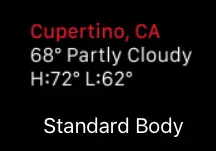
Modular Lage
let modularLargeTemplate = CLKComplicationTemplateModularLargeStandardBody()
modularLargeTemplate.headerTextProvider = CLKSimpleTextProvider(text: "")
modularLargeTemplate.body1TextProvider = CLKSimpleTextProvider(text: "")
modularLargeTemplate.body2TextProvider = CLKSimpleTextProvider(text: “”)
Modular small
let modularSmall = CLKComplicationTemplateModularSmallRingText()
modularSmall.textProvider = CLKSimpleTextProvider(text: "")
modularSmall.fillFraction = Float()
modularSmall.ringStyle = CLKComplicationRingStyle.closed
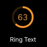
This complication is very similar to set up like the Circular Small one.
Utilitarian Small
let utilitarianSmall = CLKComplicationTemplateUtilitarianSmallRingText()
utilitarianSmall.textProvider = CLKSimpleTextProvider(text:"")
utilitarianSmall.fillFraction = Float()
utilitarianSmall.ringStyle = CLKComplicationRingStyle.closed
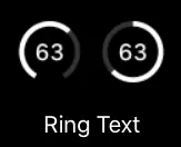
This complication is very similar to set up like the Circular Small one.
The examples show how to make a complication for only 7 out of the 11 types of complications.
Keep in mind that each complication has other possibilities to show the information — instead of a closed/open ring, one could only show text or only an image.
At the end
We gather all the complications available in one cheat sheet to make it easier to have an overview over the many complications that Apple has to offer. You can find the name of the complication and links to Apple's documentation. You can get the cheat sheet here
Article Header Photo by Lloyd Dirks on Unsplash
All other pictures taken from Apple's documentation


